Checkmate
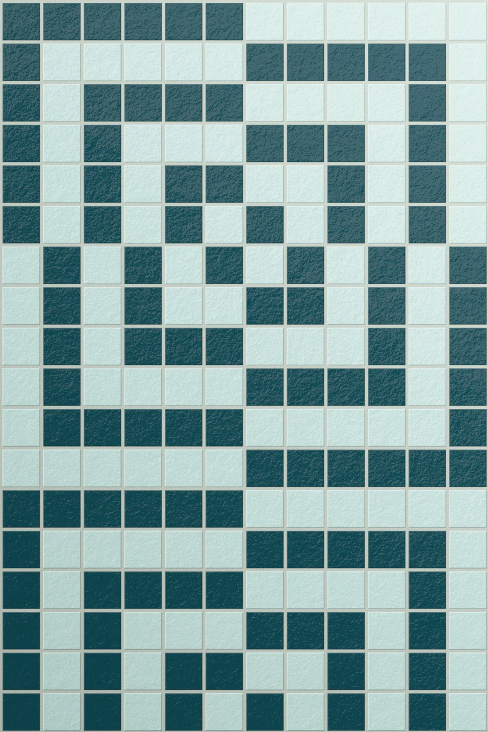
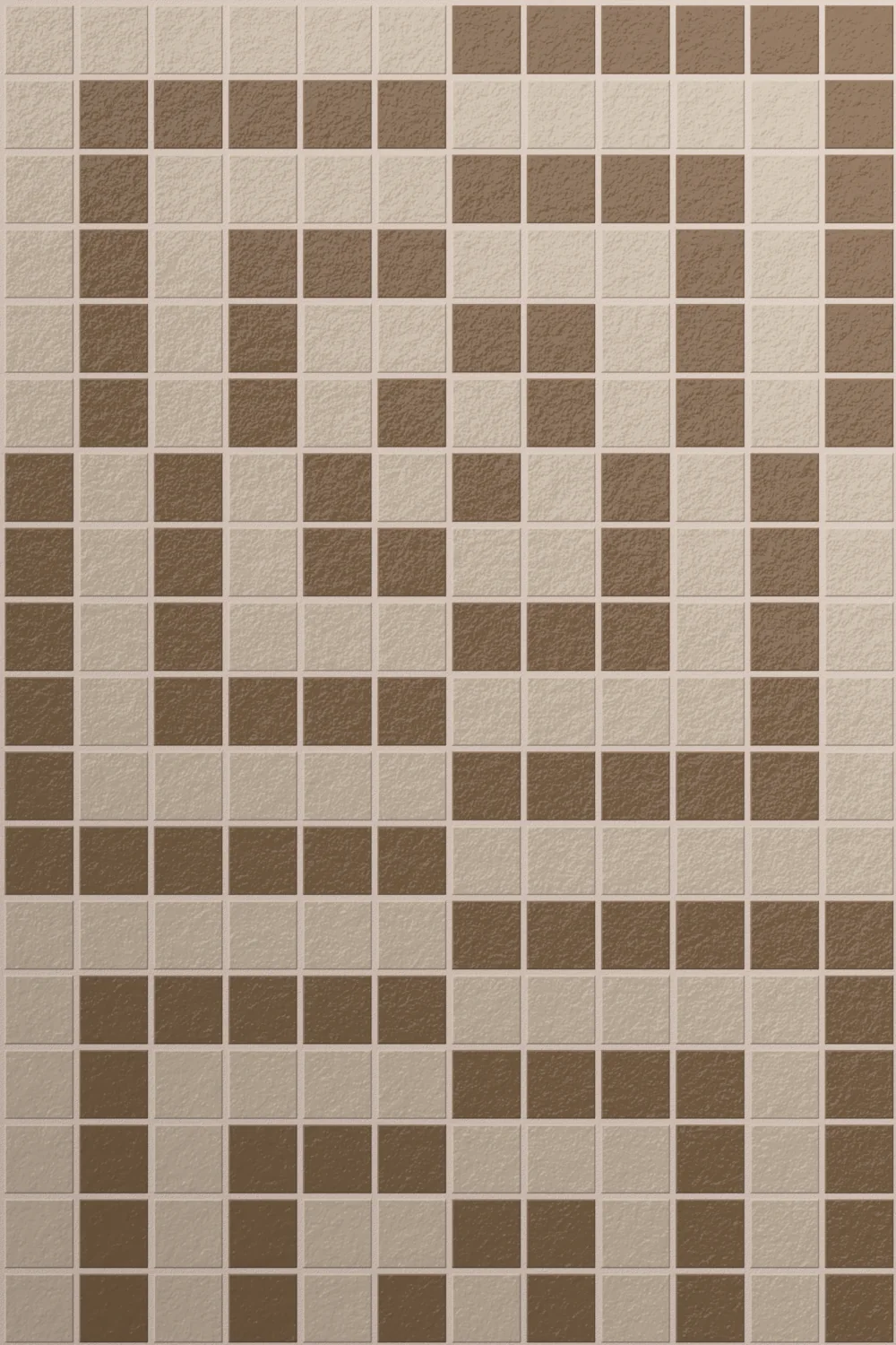
The Colours


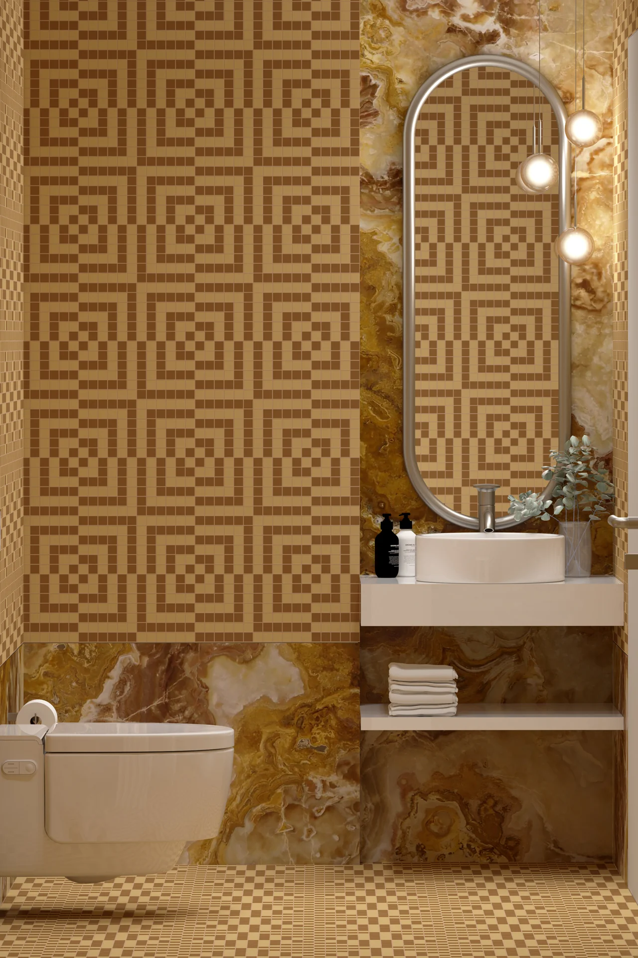

About Checkmate Mosaic
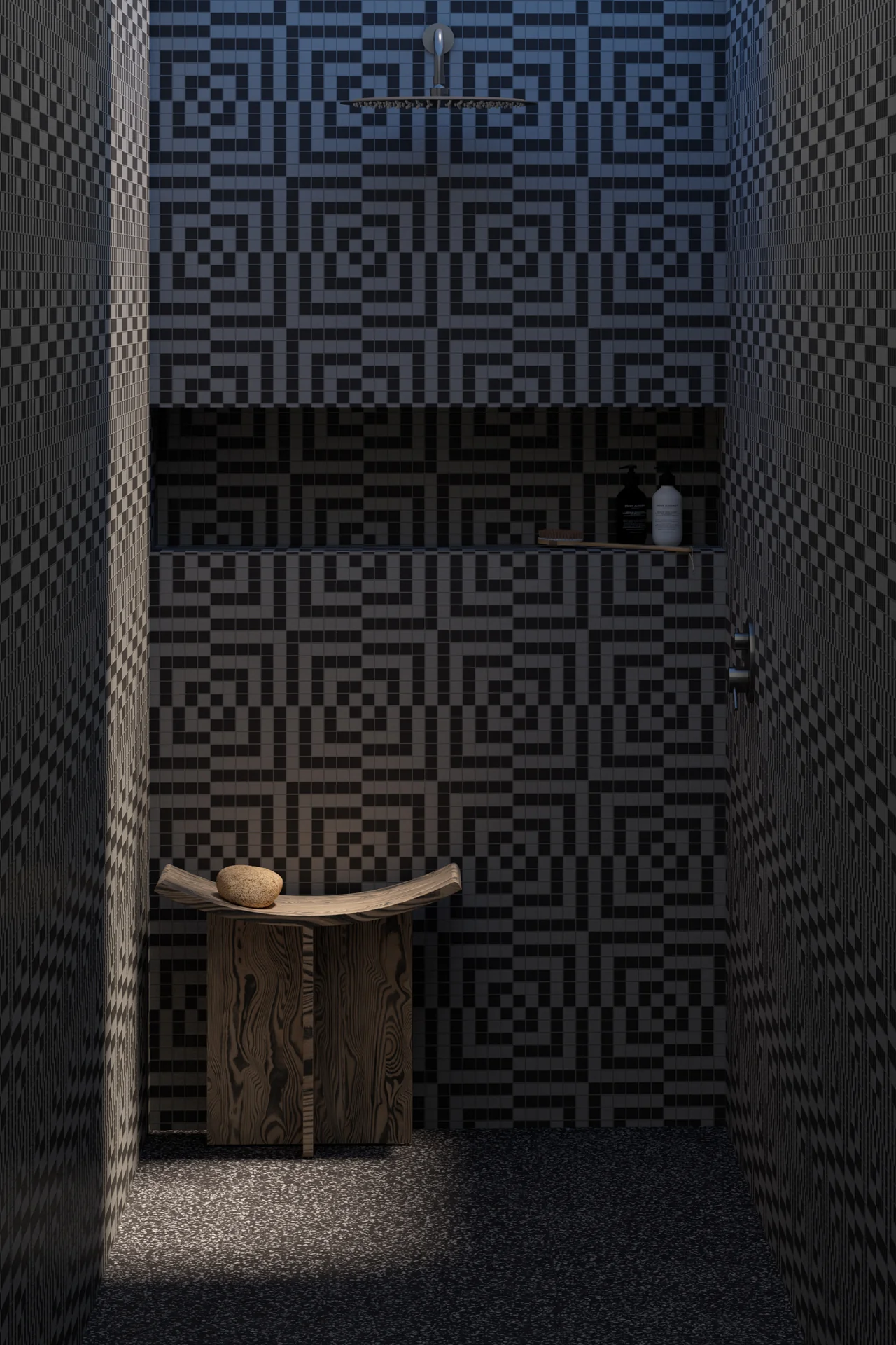
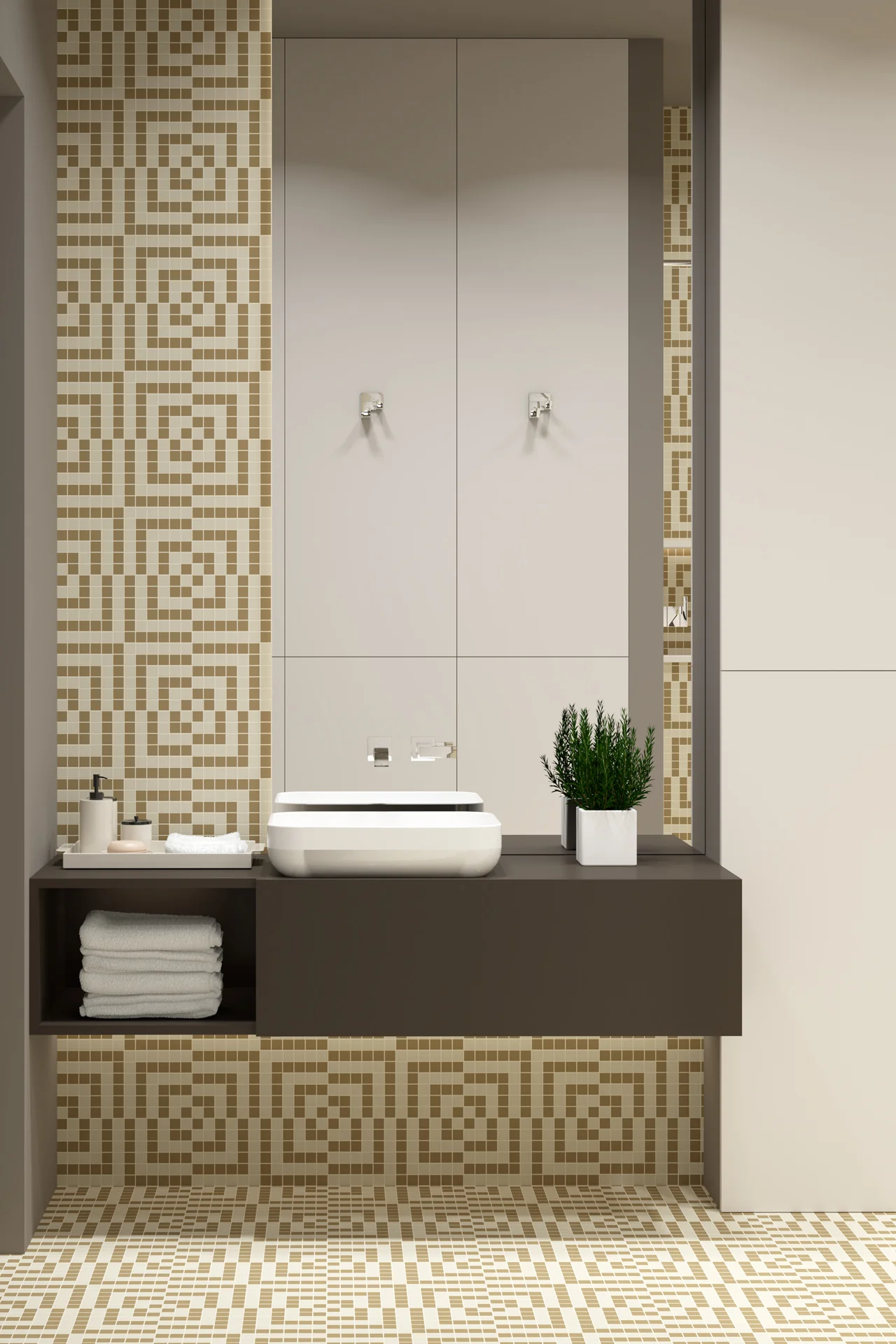
Checkmate brings a quiet sense of order to a space, yet it never feels rigid. The pattern builds from a familiar grid, then gently shifts into something more layered and considered. As a result, the surface feels structured but still relaxed, giving the room a steady rhythm without making it feel formal.
The design works by balancing contrast and continuity. Lines move across the surface, then loop back on themselves, creating moments of pause before the pattern picks up again. Because of this, the eye keeps moving, but never feels rushed. It holds attention in a calm, measured way.
Colour plays a supporting role here. In softer tones, the pattern settles into the background and creates a composed, almost architectural feel. Push the contrast, and it becomes more graphic, adding definition and energy. Either way, the pattern stays clear and easy to read.
In smaller spaces, the bold graphic look adds depth without closing things in. The repeating geometry gives the illusion of scale, helping the room feel more open and connected. In larger settings, it creates continuity, tying surfaces together so everything feels intentional.
Overall, Checkmate sits comfortably between statement and subtlety. It brings clarity, rhythm, and a sense of balance to the space, while still leaving room for everything else to sit alongside it.
Availability and Sales enquiries to Tessere Mosaico