

Tapi
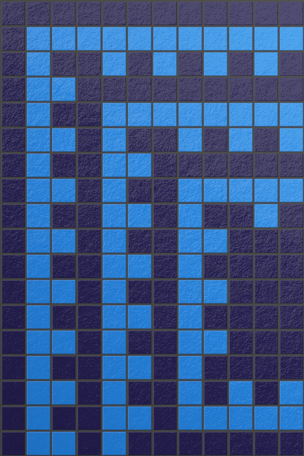
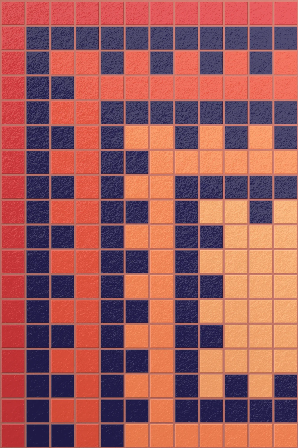
The Colours
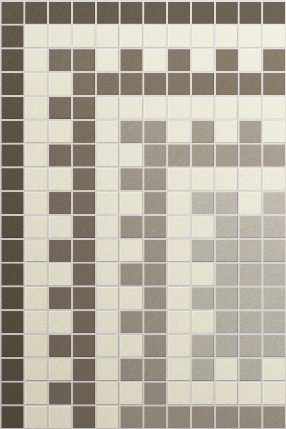
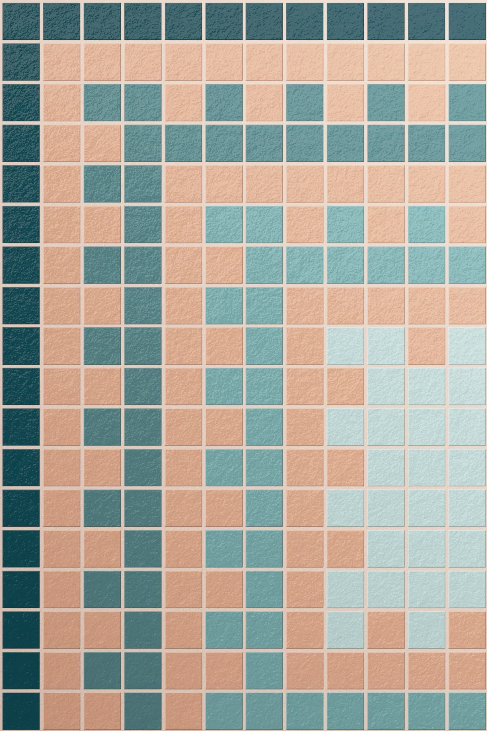
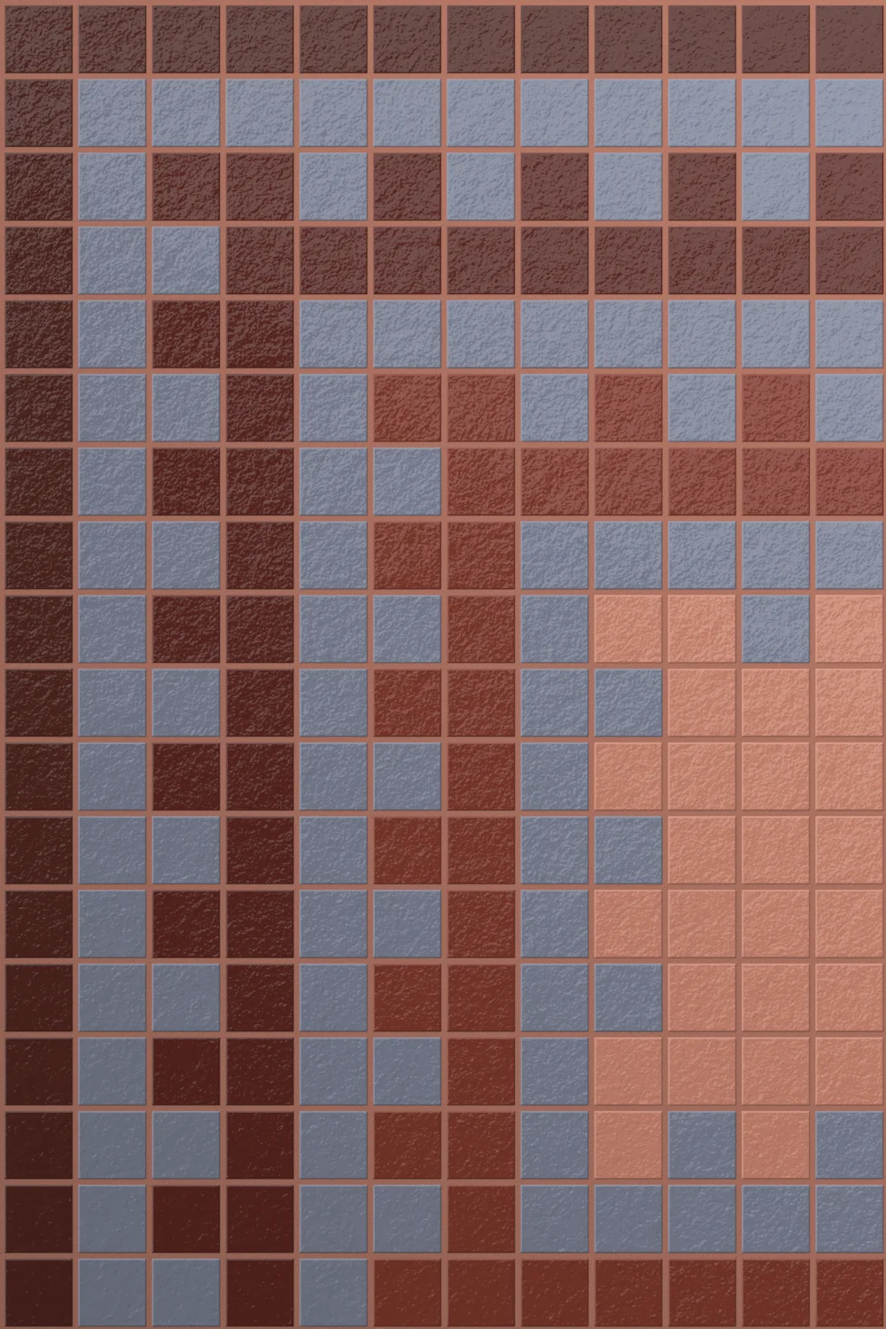
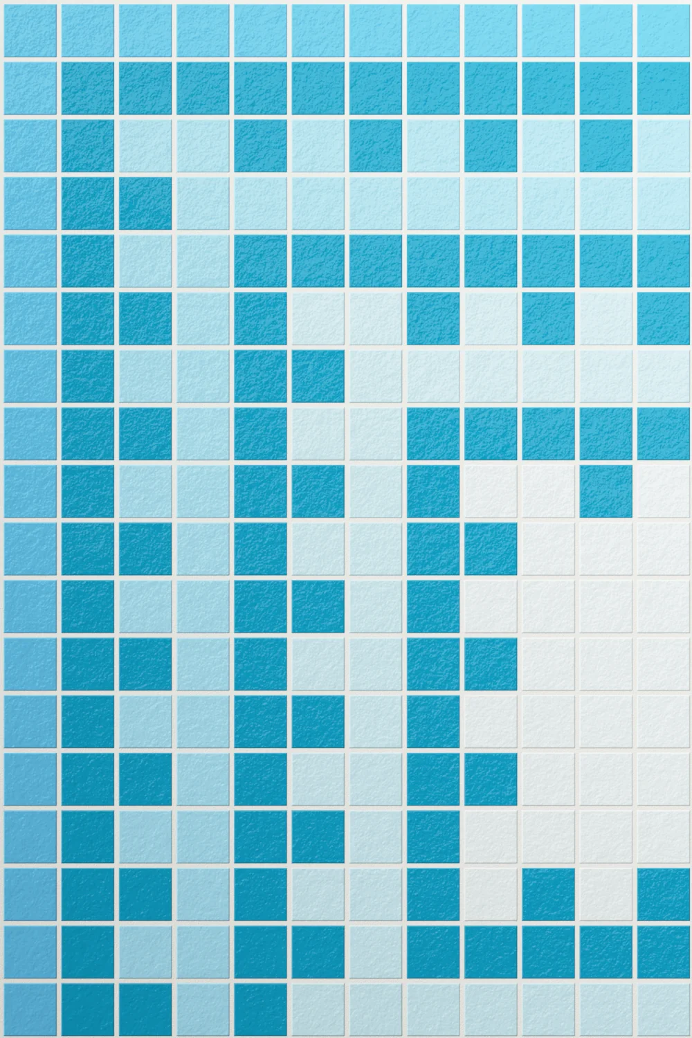

About Tapi Mosaic
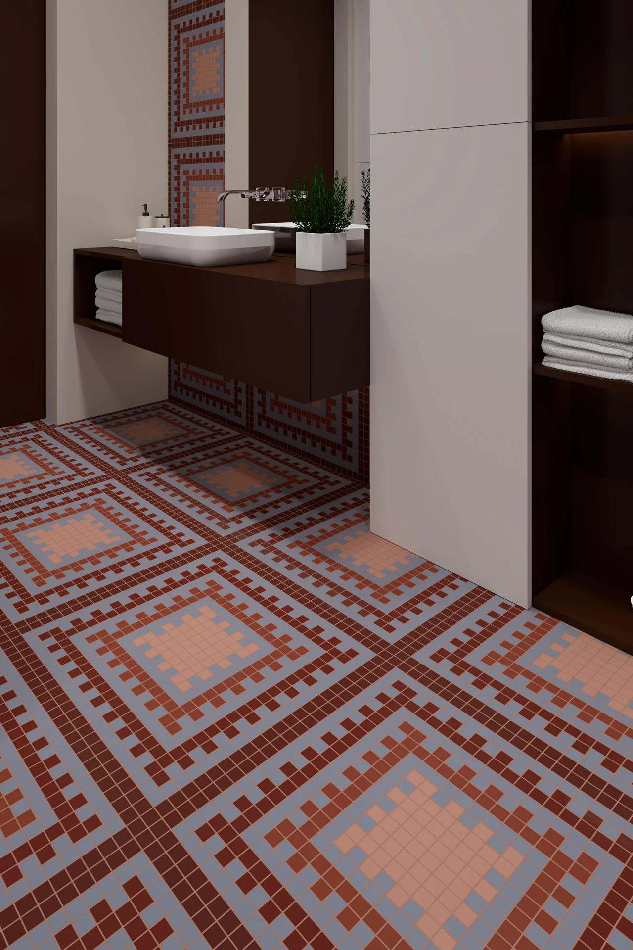
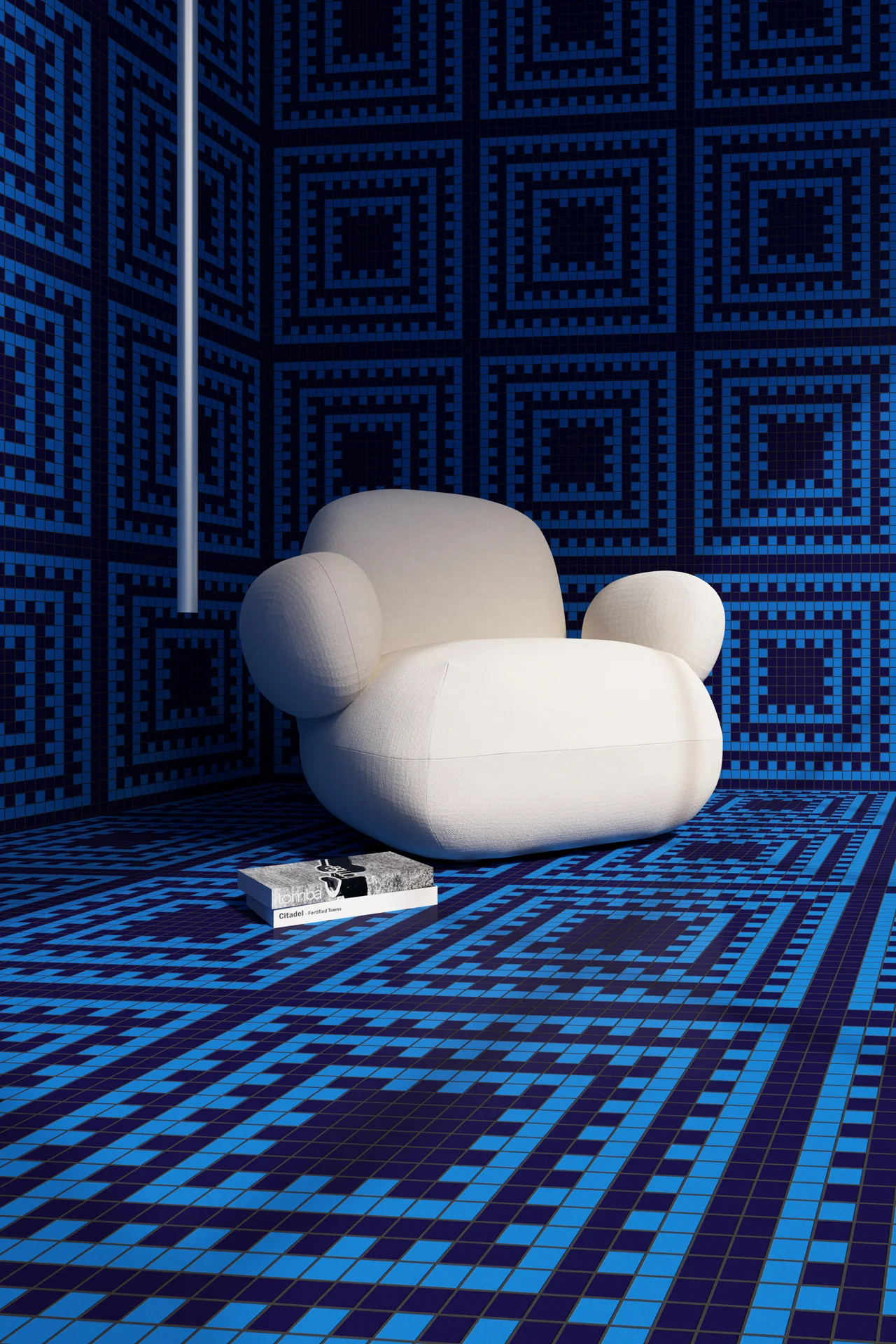
Tapi brings a calm, grounded rhythm to a space, with a pattern that feels both familiar and quietly detailed. The square layout sets a clear structure first. Then the layered borders begin to reveal themselves, adding depth in a way that feels natural rather than decorative. As a result, the surface feels settled, yet far from plain.
There is a steady repetition running through the design. Each square holds its own, while still connecting to the next. Because of this, the pattern creates a gentle flow that carries across the room without drawing too much attention to itself. It feels composed and easy to live with.
Colour keeps the mood soft and balanced. In warmer tones, Tapi brings a subtle warmth that makes the space feel inviting and relaxed. In cooler shades, it leans more towards a quiet, architectural feel. Either way, the pattern remains clear and reassuring.
In smaller spaces, Tapi adds depth without closing things in. The layered squares create a sense of structure that helps everything feel more organised. In larger areas, it builds a consistent field that ties walls and floors together with ease.
Overall, Tapi feels calm and dependable. It offers a quiet level of detail that supports the space, creating interiors that feel comfortable, considered, and effortlessly put together.
Availability and Sales enquiries to Tessere Mosaico