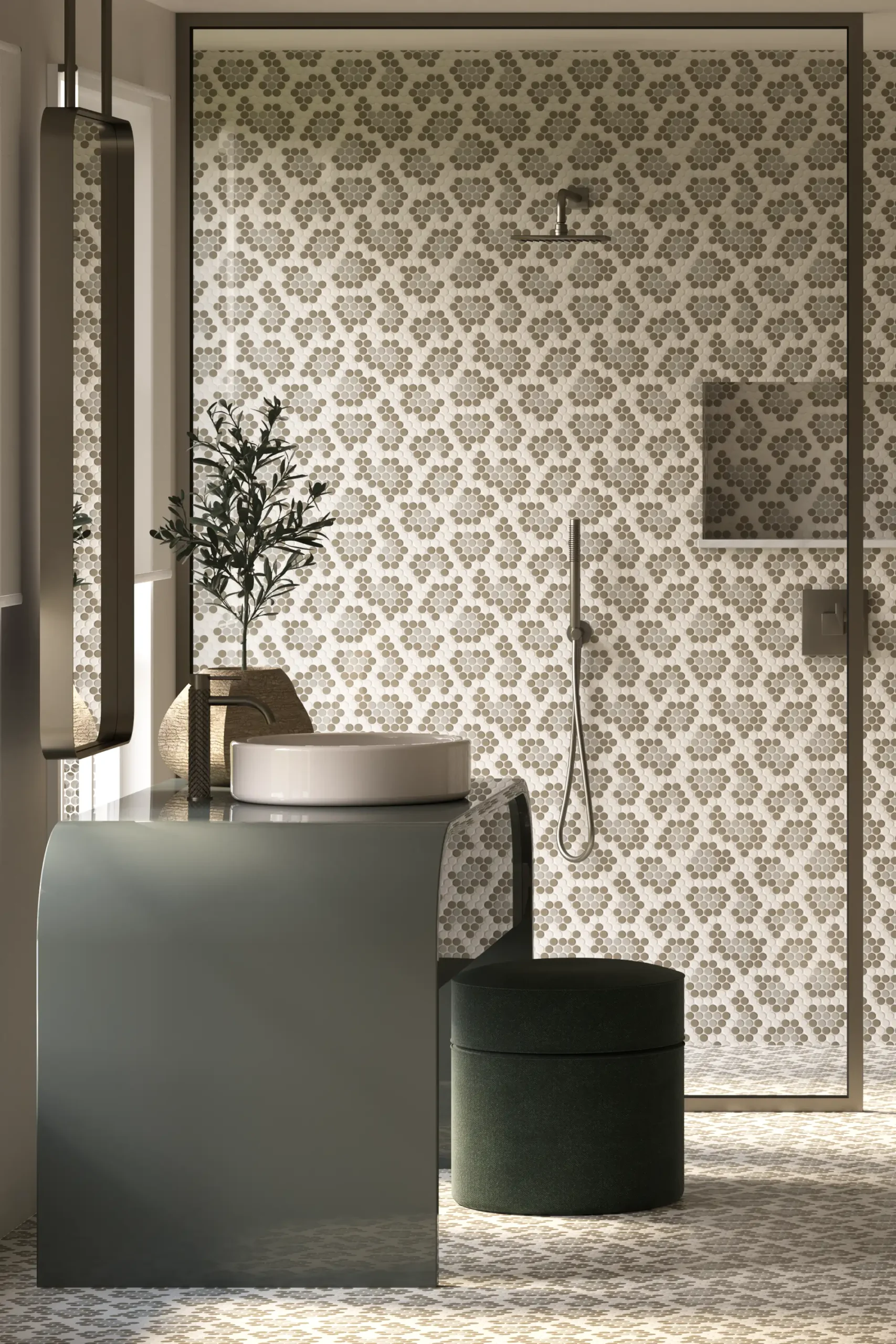
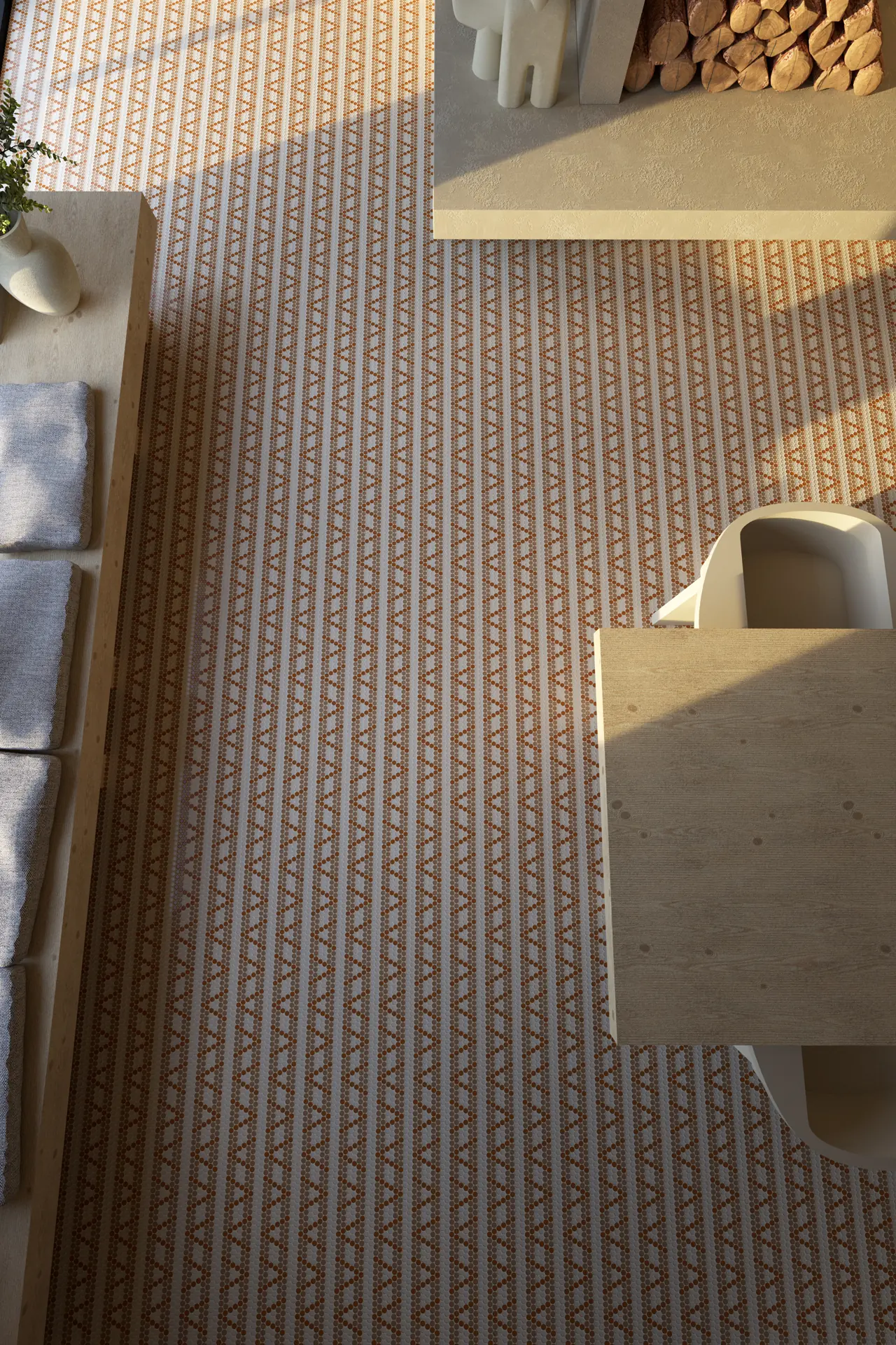
Chevron
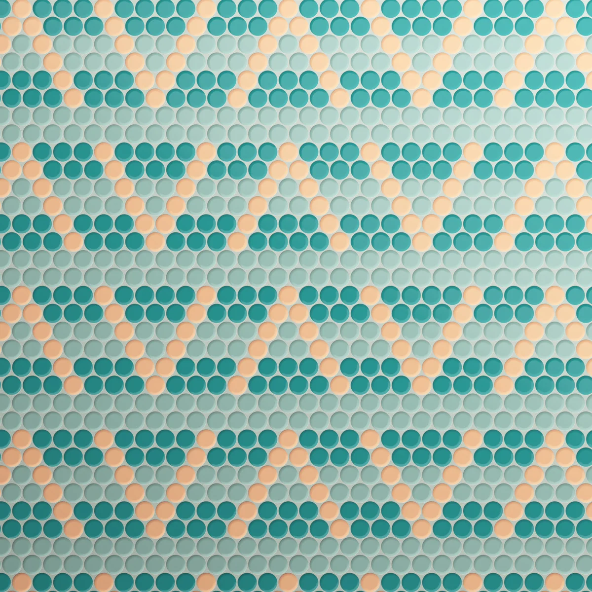
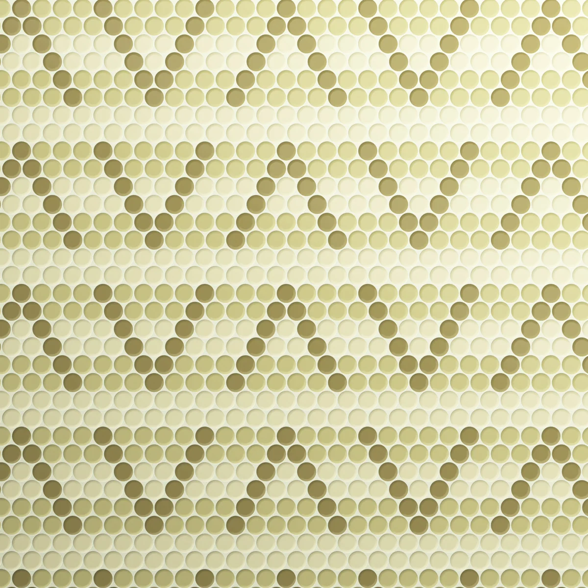
The Colours

About Chevron Mosaic
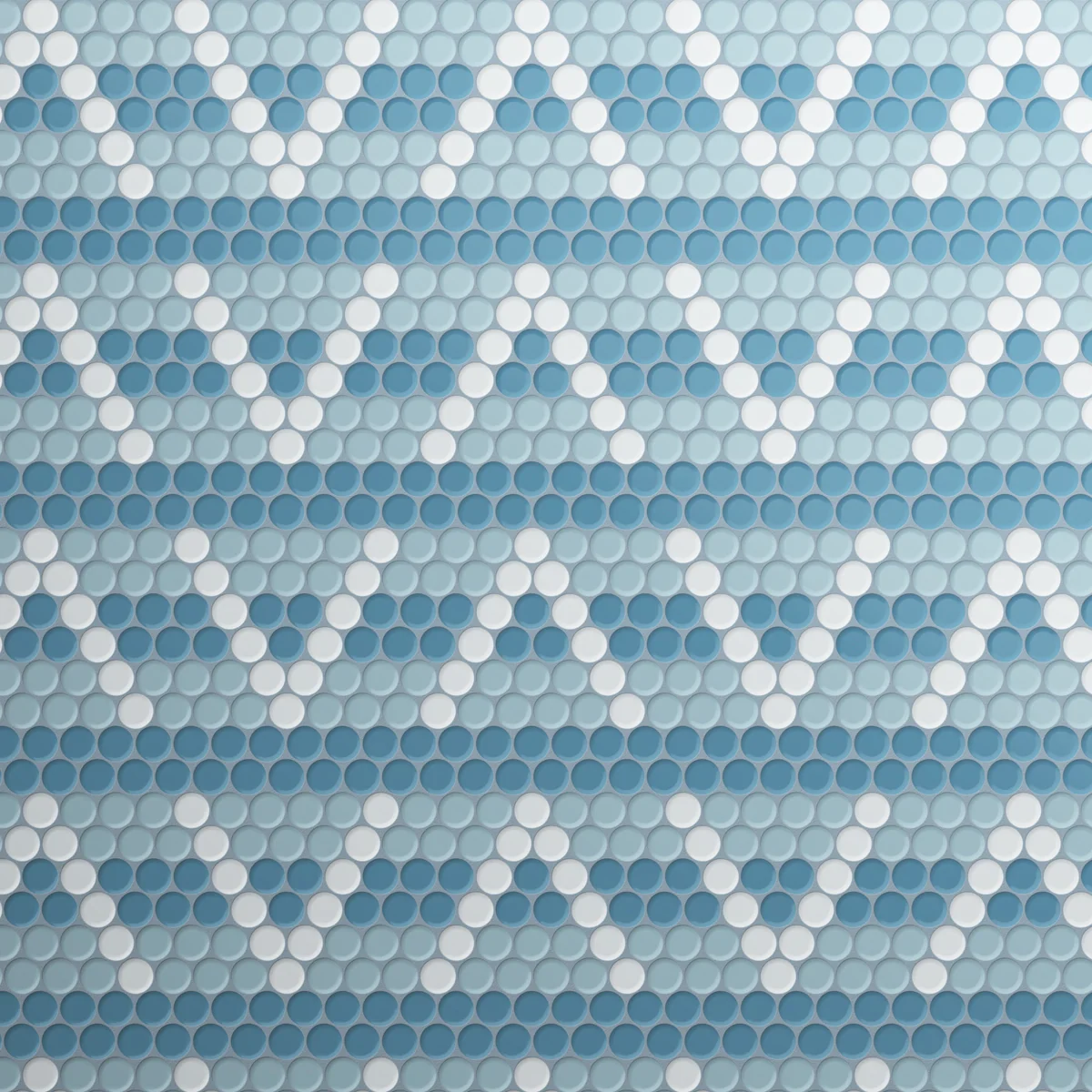
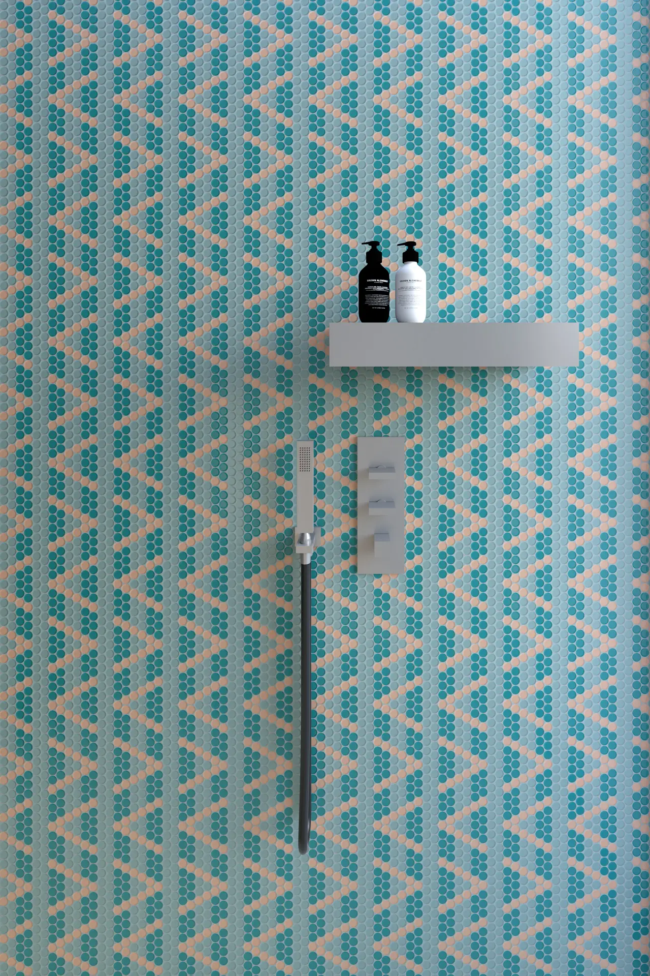
Chevron plays with recognition. We are remarkably good at finding familiar forms from incomplete information, often seeing the whole long before every part has been explained. Pattern can exploit that instinct.
Here, the familiar zigzag is treated more as an idea than an image. Its presence is suggested through shifts in direction and colour. Nothing needs to be outlined or fully resolved. The eye makes the connection almost automatically.
This feels more interesting than simply reproducing a chevron in mosaic. It introduces a degree of ambiguity. What appears at first to be a striped surface gradually reveals another order running through it. Depending on where attention settles, one reading can briefly overtake the other.
There is something rather textile-like about this uncertainty. Woven patterns often rely on colour passing through an established structure. A motif emerges from the weave rather than sitting on top of it. Round tesserae create a similar effect here. Their softness takes some of the insistence away from the geometry.
The relationship between colours becomes important as a result. They are not simply filling predetermined shapes. They determine how readily the underlying idea appears. A subtle palette can make the chevron almost incidental, while greater contrast makes its presence harder to ignore.
Chevron is really an exploration of visual shorthand. It asks how much of a familiar pattern needs to be present before the mind supplies everything else. The answer, reassuringly, is very little.
Availability and Sales enquiries to Tessere Mosaico
Burano 20mm Round Mosaic