Checkmate
The Colours





About Checkmate Mosaic
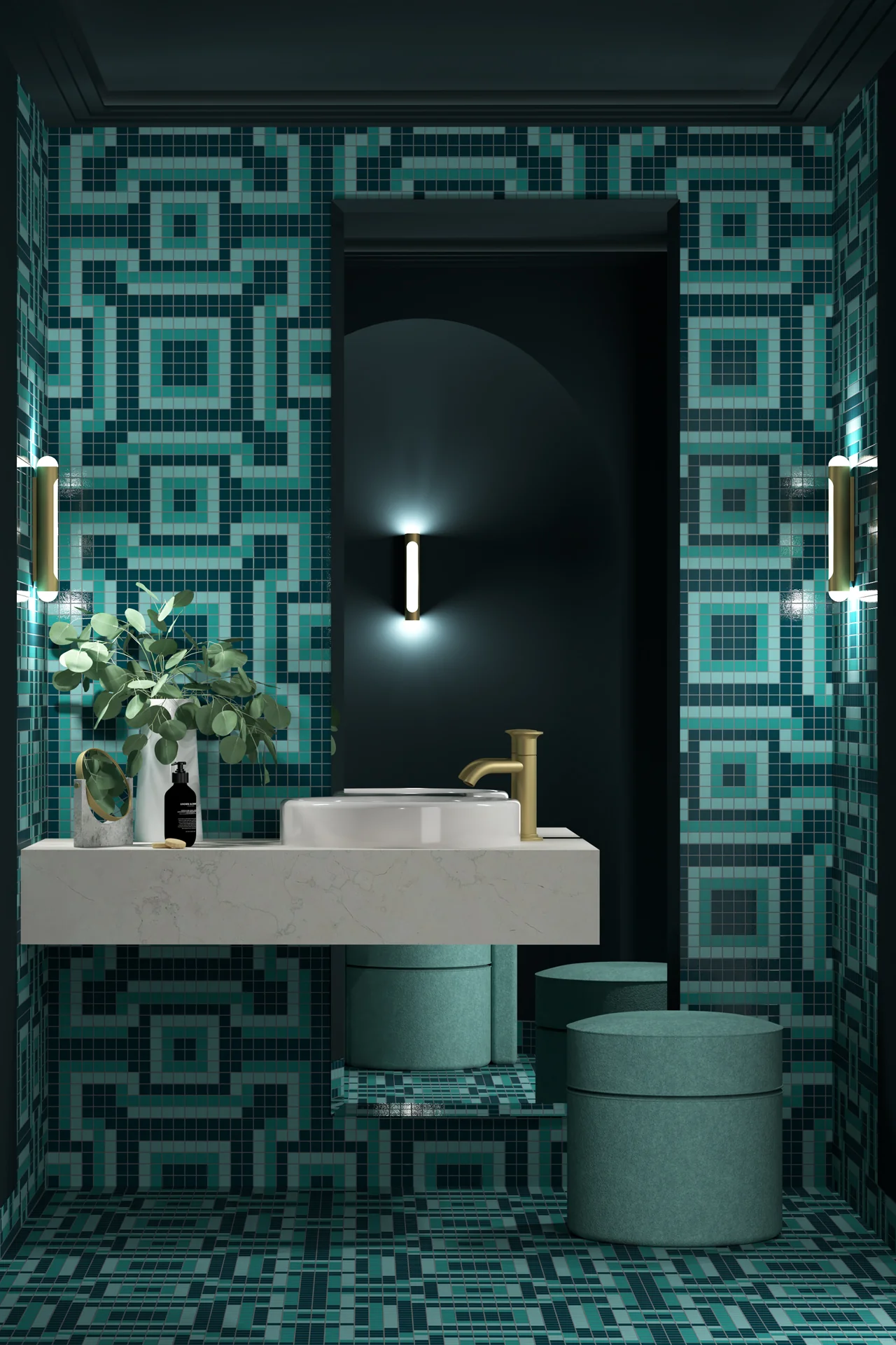
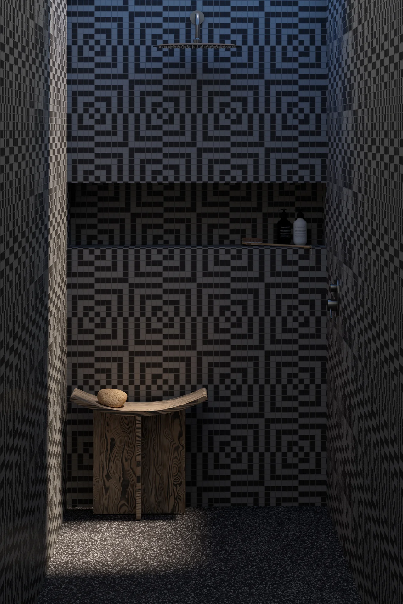
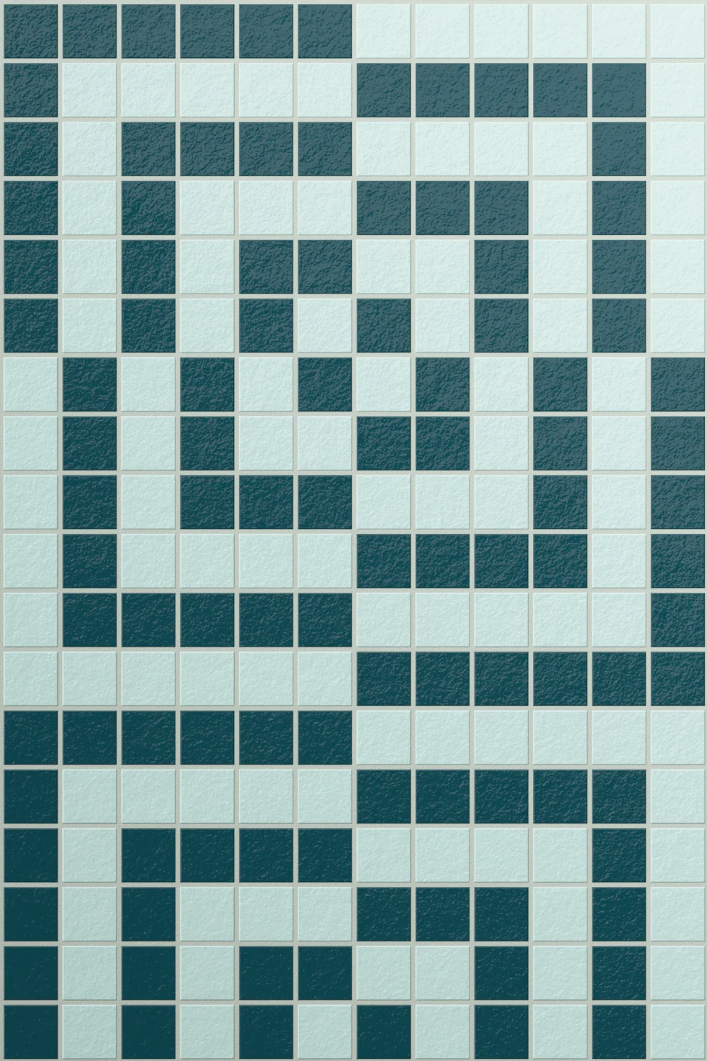
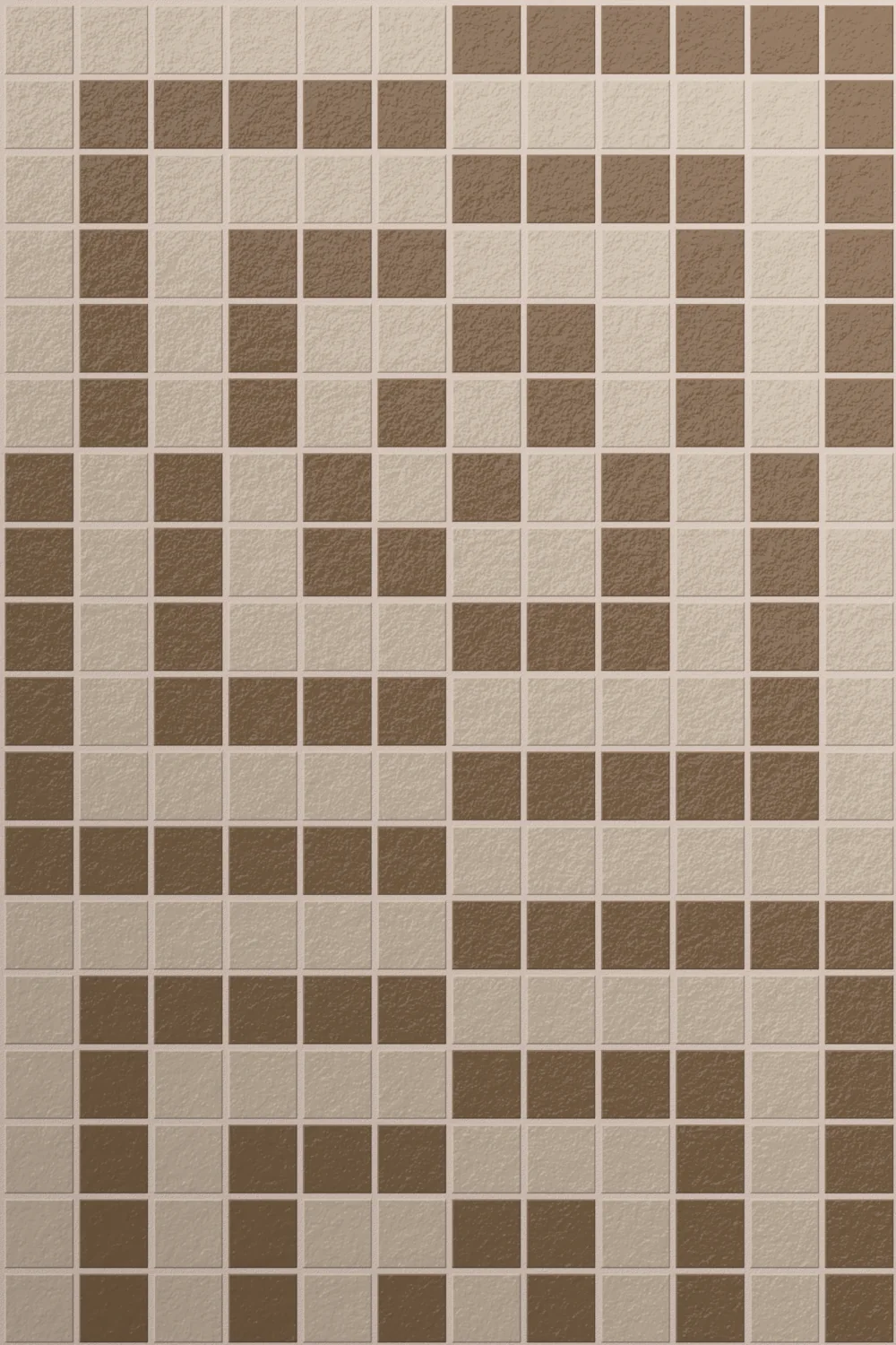
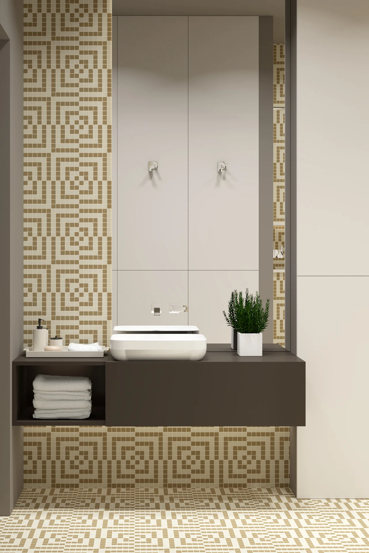
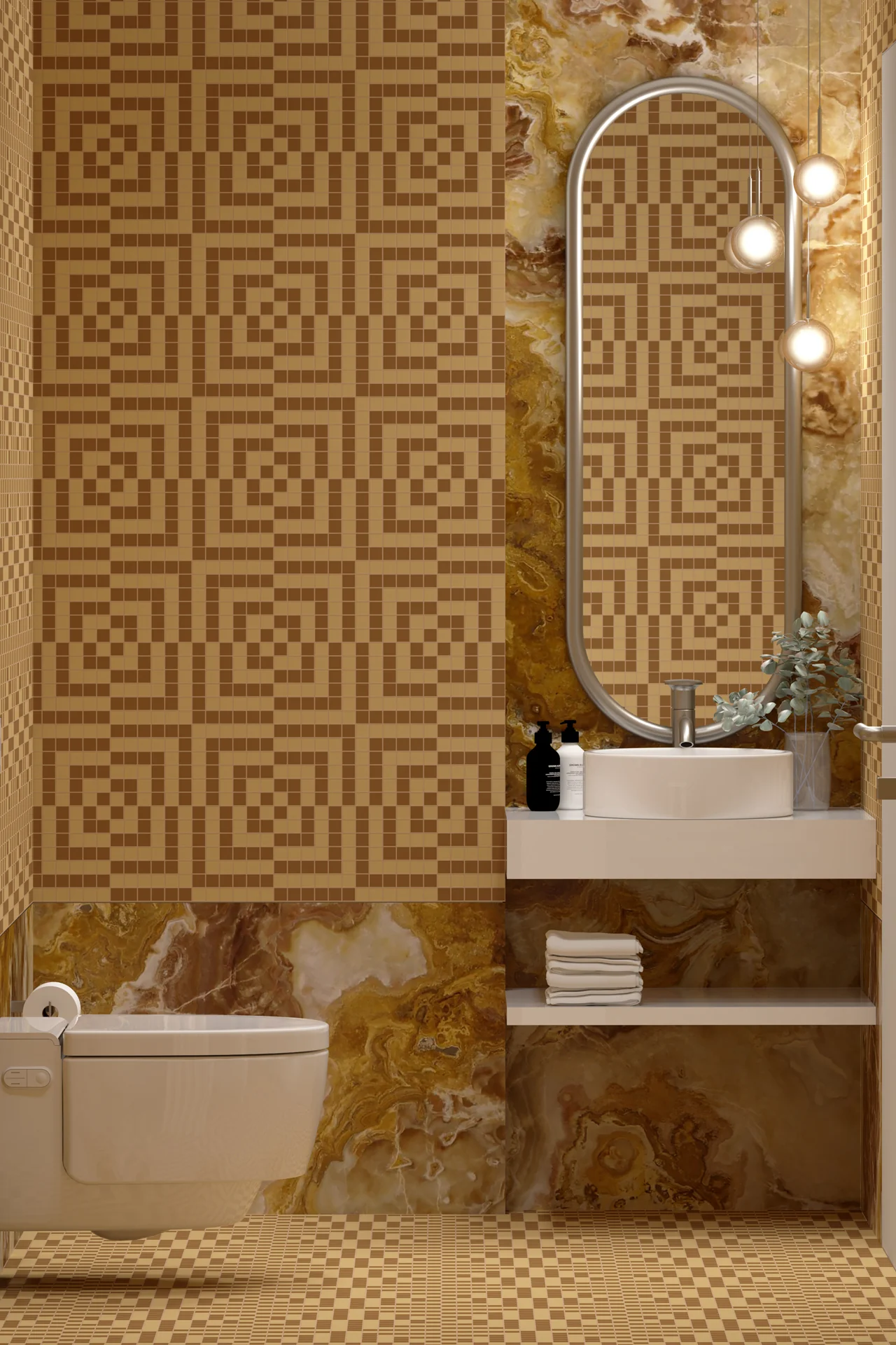
Checkmate draws on the graphic confidence of mid-century design, when geometry became a playground for perception. Op art pushed this particularly far, using repetition, contrast and carefully controlled distortion to make static surfaces appear unexpectedly active.
That influence gives Checkmate its starting point. The square grid offers something familiar and rational, but the pattern refuses to remain entirely settled. Lines appear to advance and retreat, while neighbouring forms compete for attention. What should be a straightforward arrangement begins to play small tricks on the eye.
This tension between order and illusion became an important part of post-war graphic culture. Artists and designers discovered that very simple geometry could create surprisingly complex visual experiences. Movement did not need to be illustrated. It could be suggested through the relationship between one shape and the next.
Checkmate brings some of that thinking into mosaic. The regularity of the square pieces establishes a strict framework, which makes the apparent shifts within the larger pattern more convincing. Geometry works against geometry, using the discipline of the grid to suggest something less stable.
There is a certain pleasure in a pattern that refuses to remain completely still. Checkmate uses one of the simplest forms in design, the square, then turns repetition into an optical game. Its mid-century reference is clear, but the fascination lies in something more universal: our willingness to see movement where none exists.
Availability and Sales enquiries to Tessere Mosaico
Milano 23mm Mosaic