Glyph
Wallpaper
Glyph
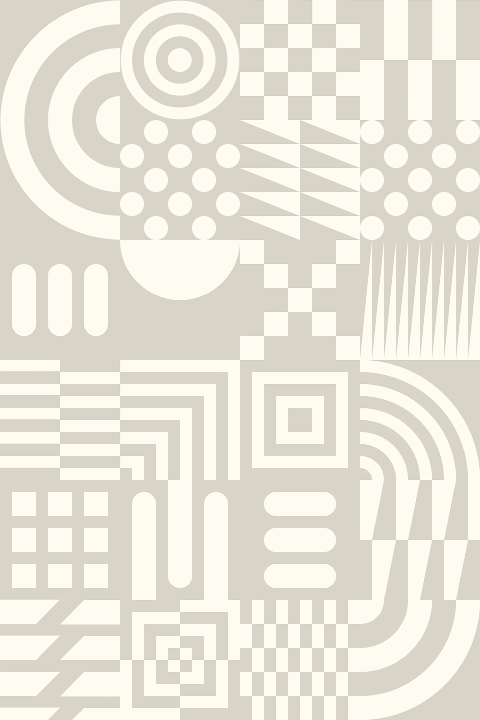
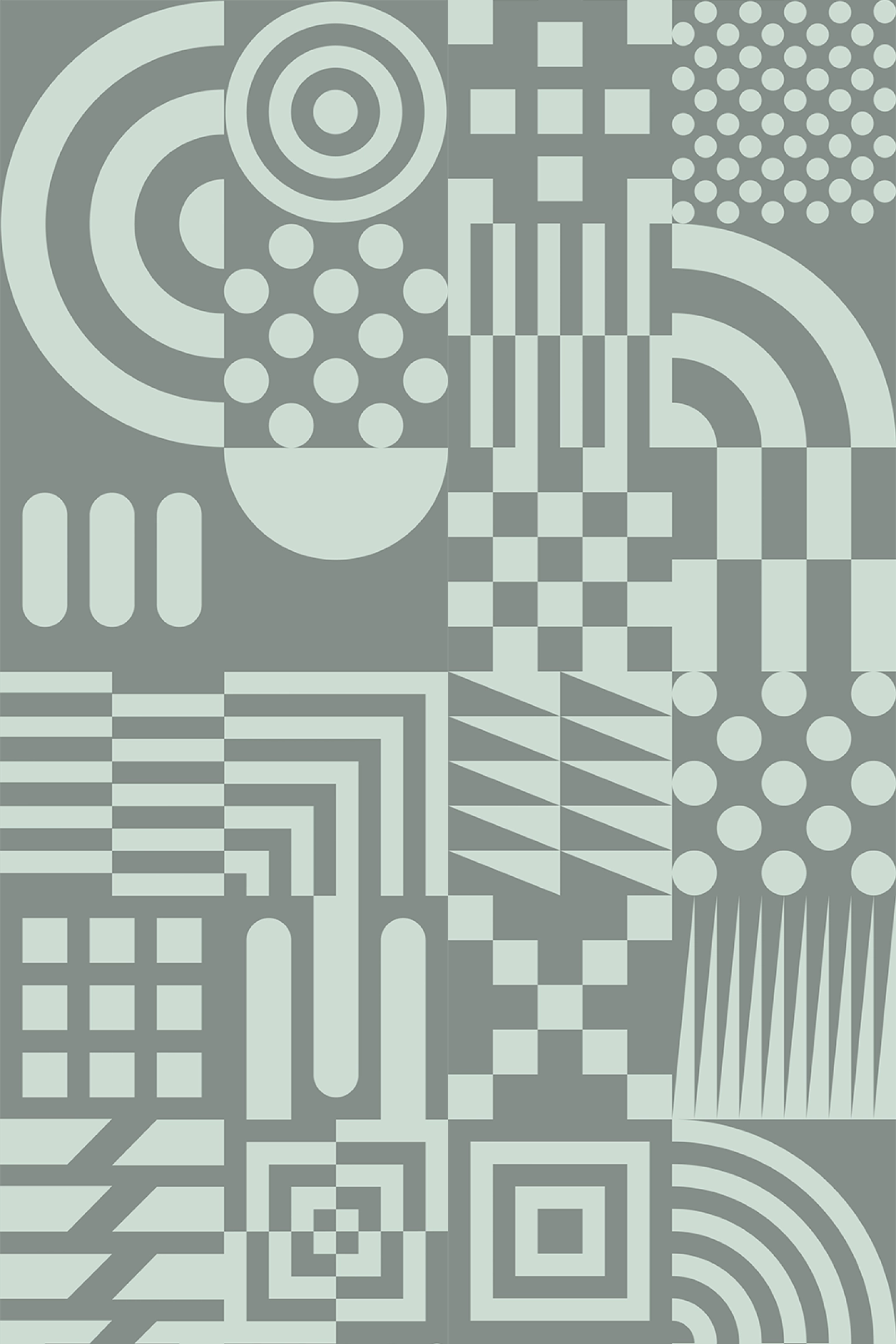
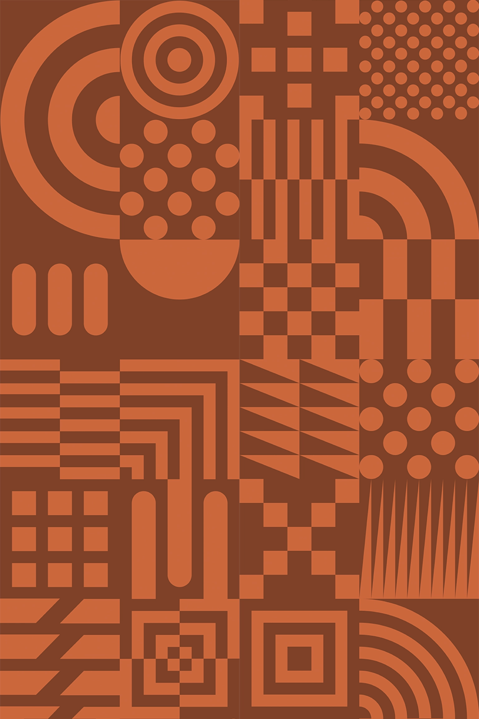
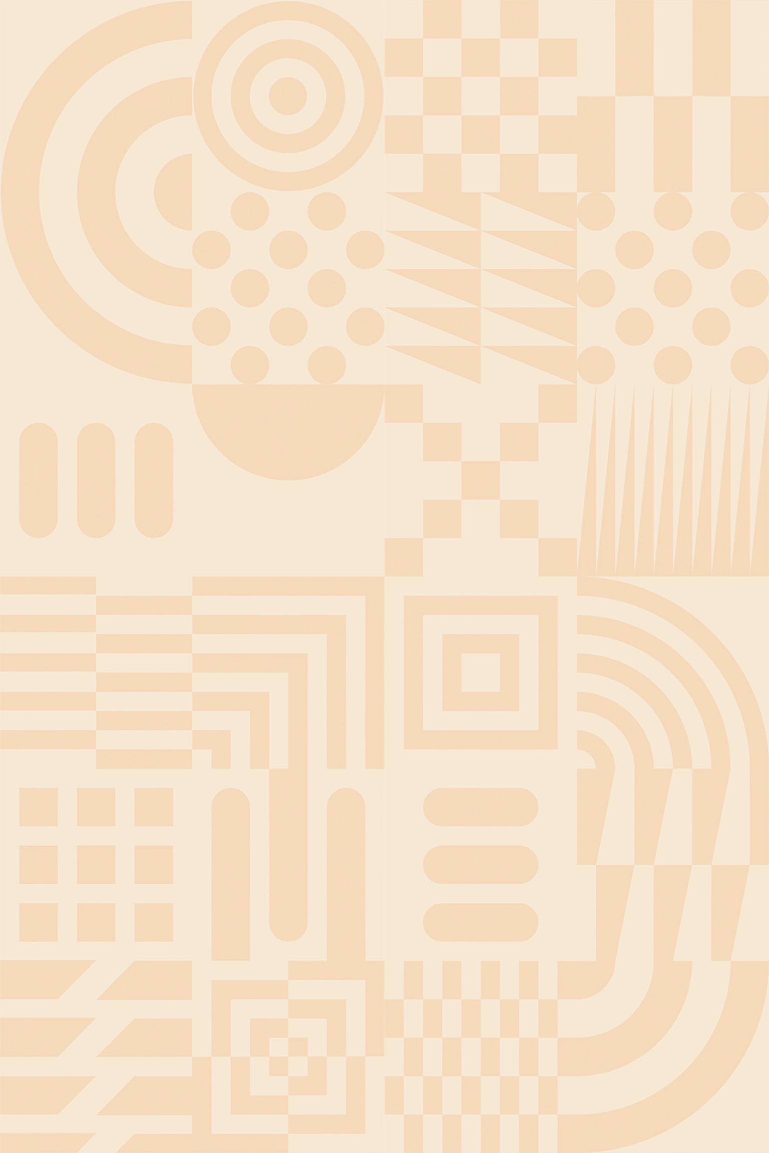
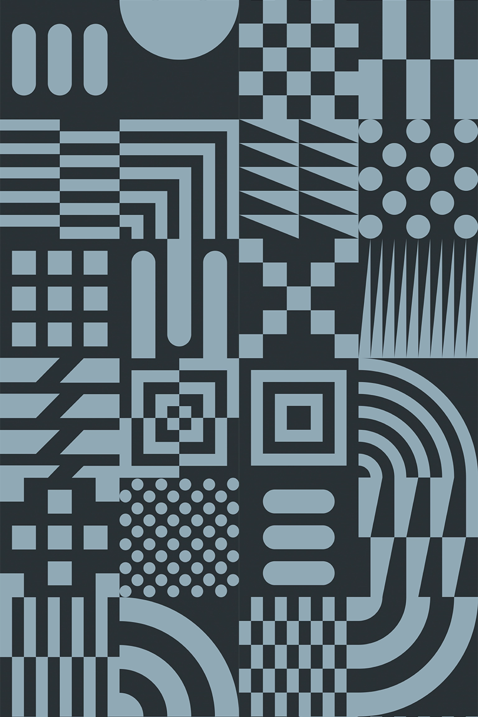
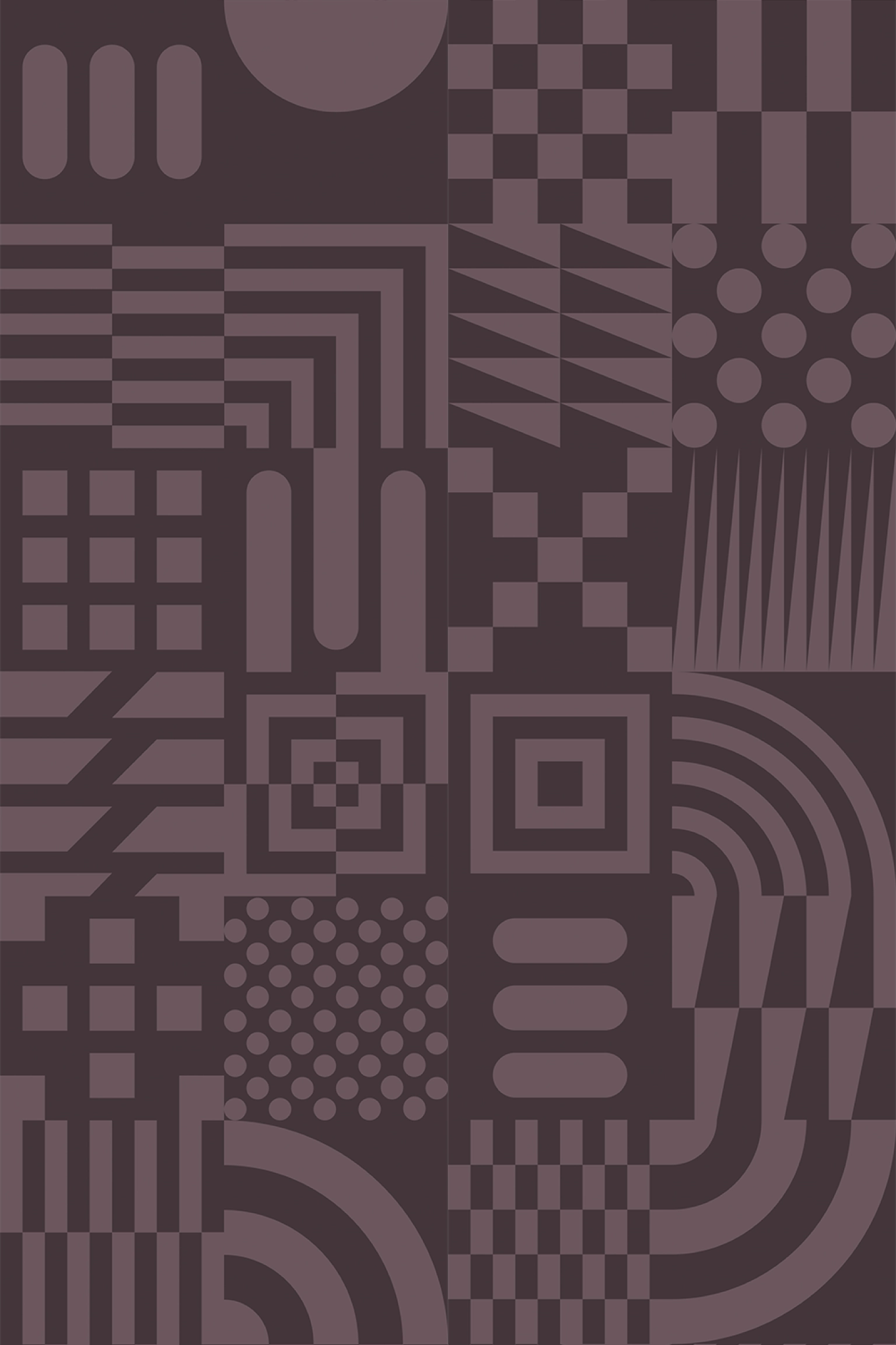
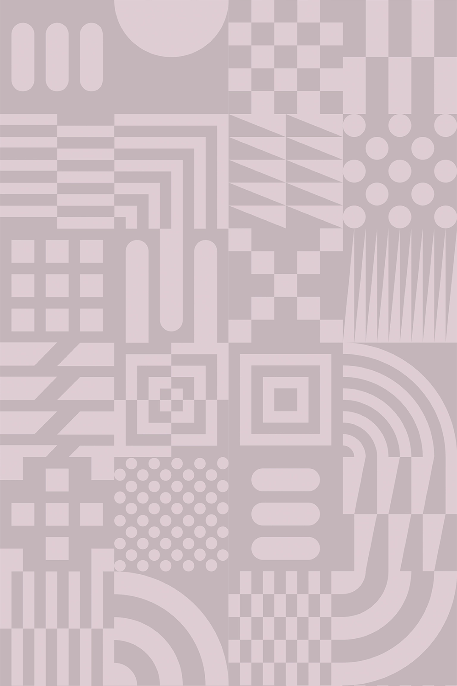
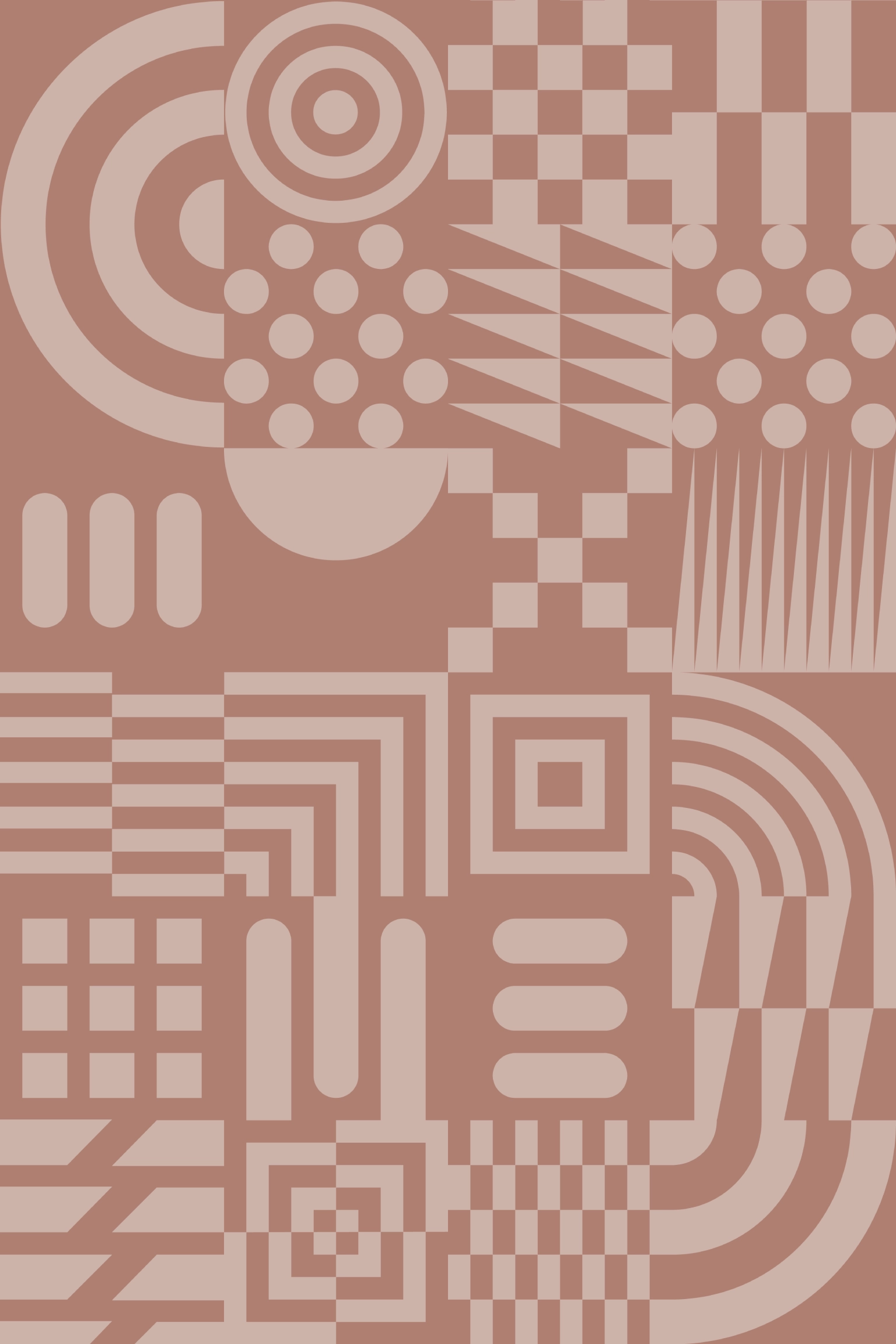
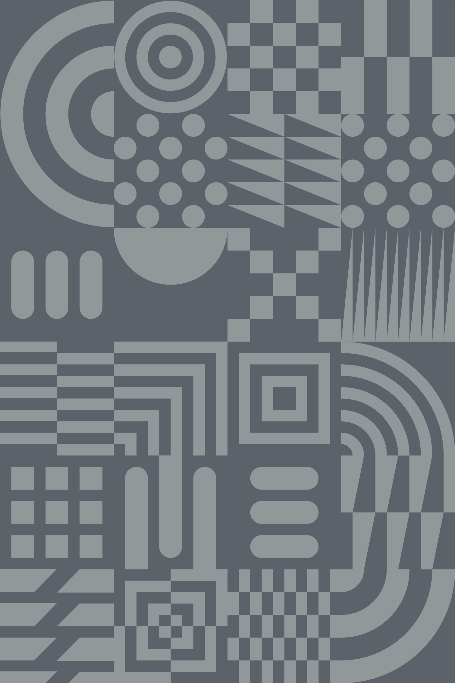
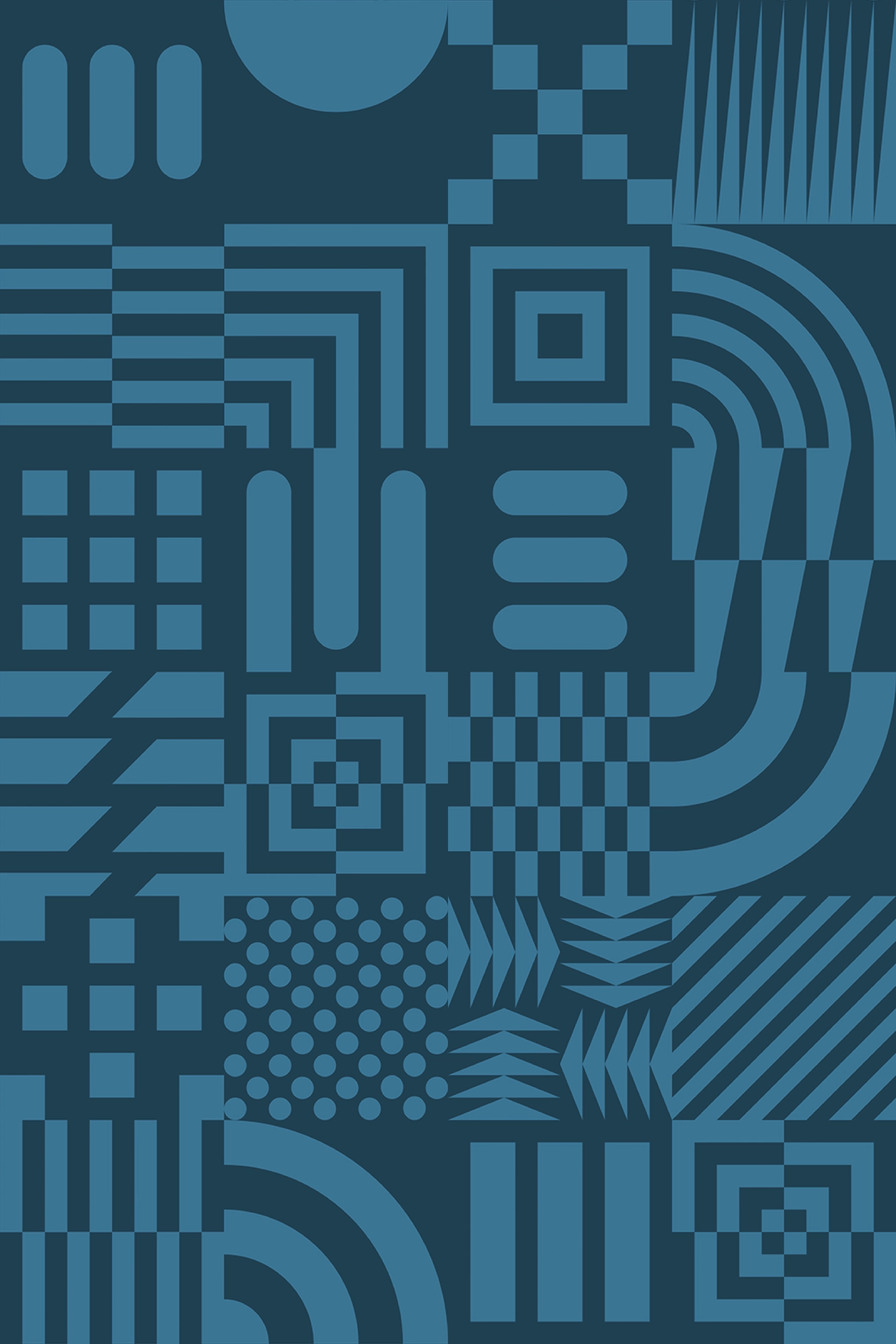
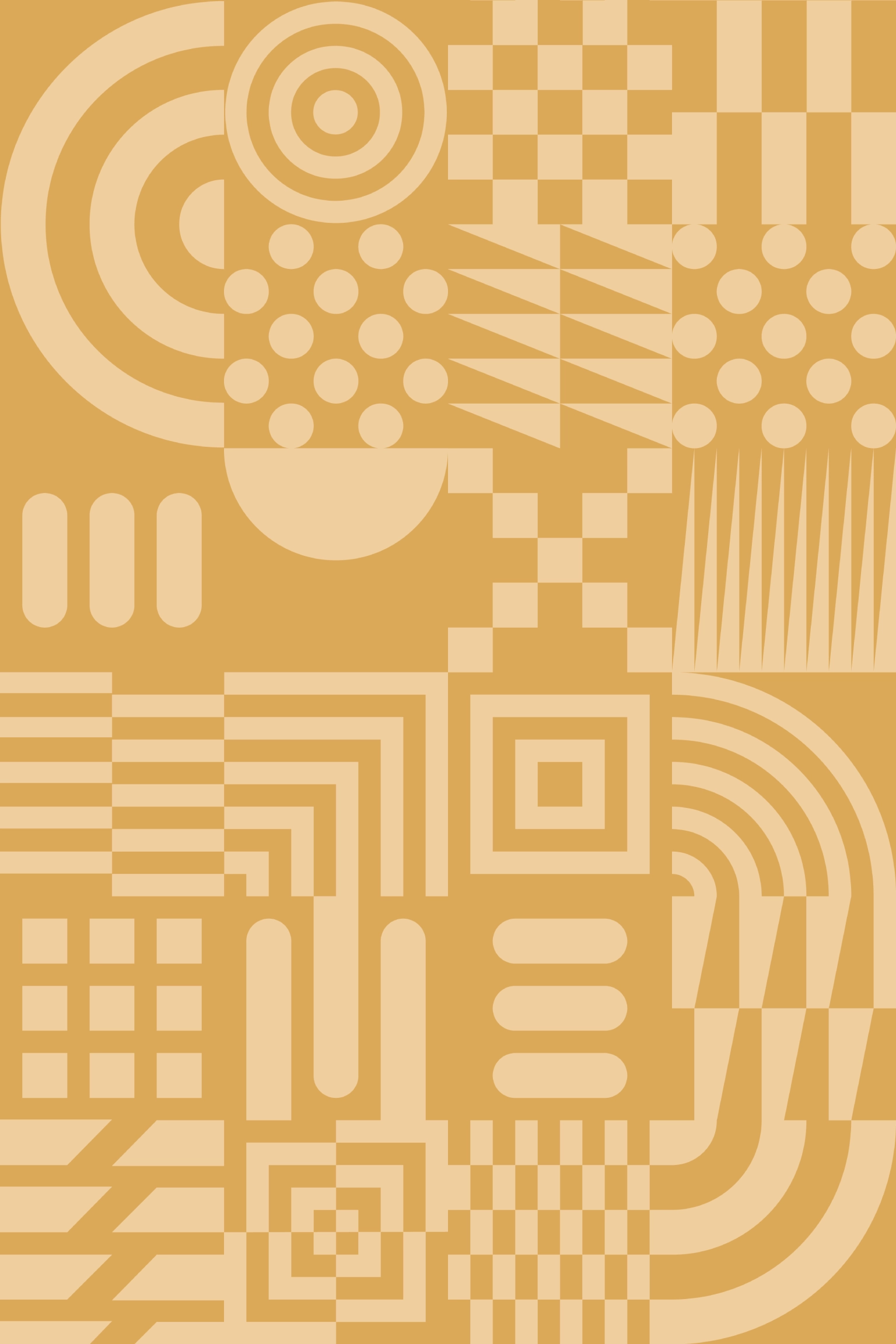
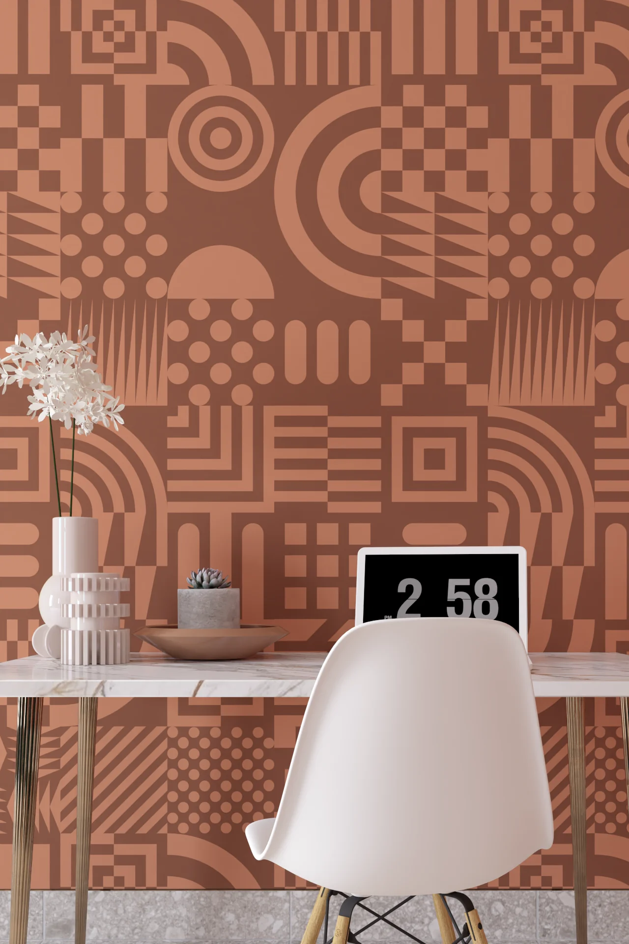
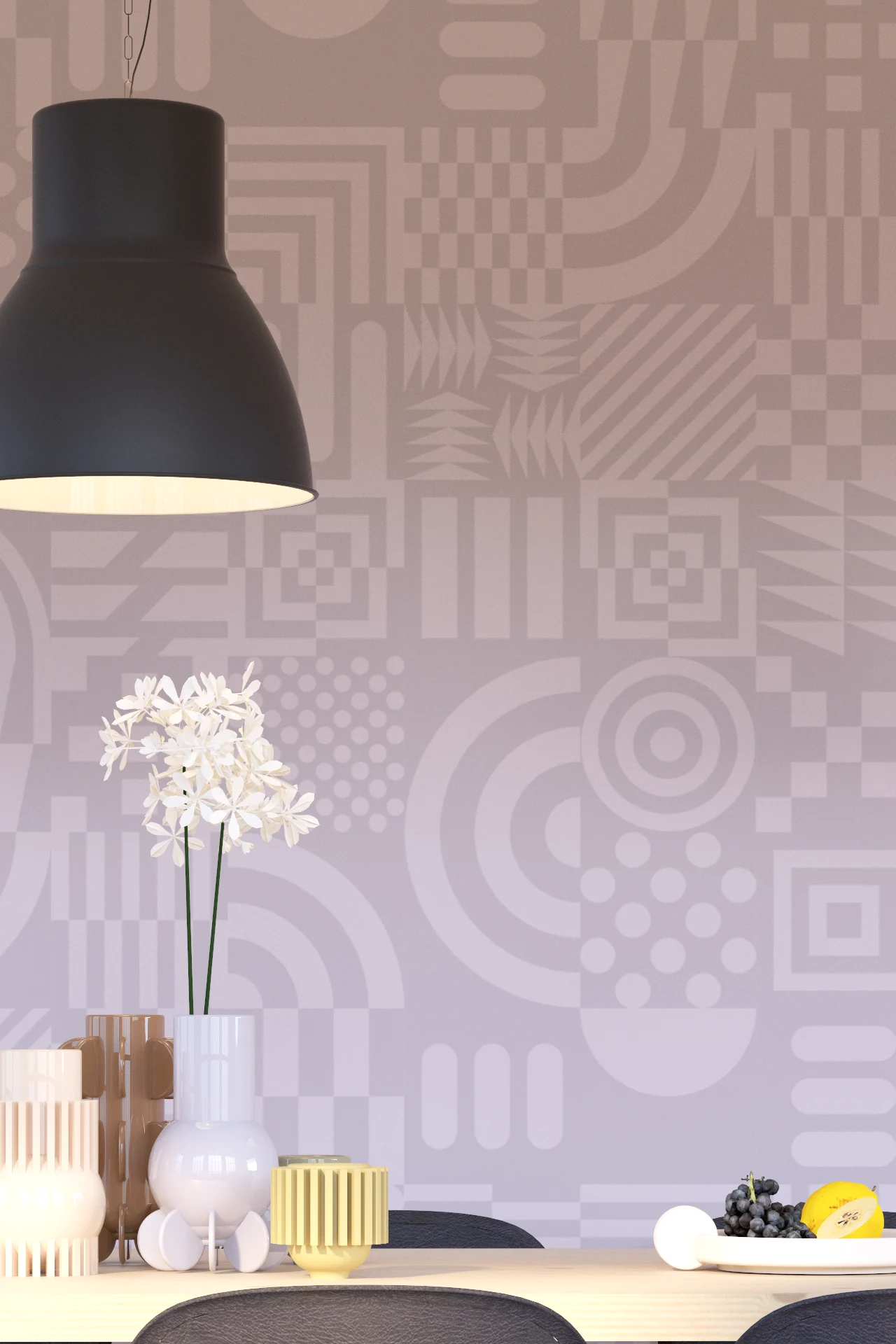
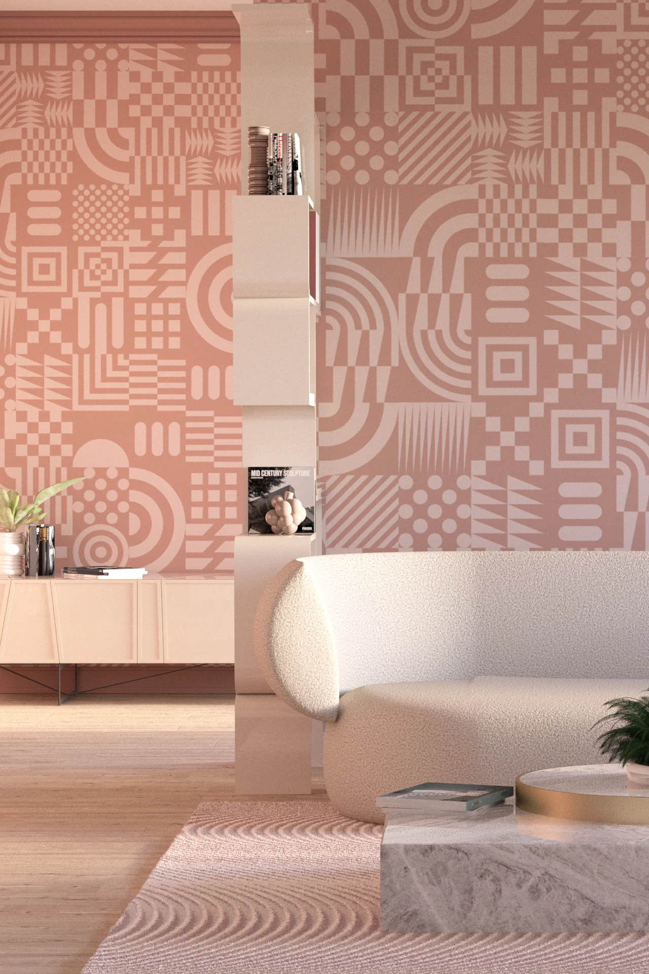
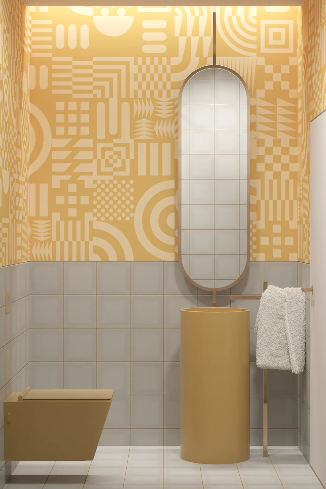
Glyph has little interest in visual order. Symbols jostle for space, small graphic incidents interrupt larger ones and individual marks are quickly absorbed into the noise of the whole. It is busy, slightly chaotic and deliberately difficult to take in at once.
There is something distinctly late twentieth-century about that attitude. The graphics surrounding club culture and electronic music were often extraordinarily free. Flyers, posters and record sleeves mixed whatever happened to work: found imagery, crude digital marks, fragments of type, diagrams and symbols borrowed from almost anywhere. Polish mattered rather less than energy. Glyph shares some of that irreverence.
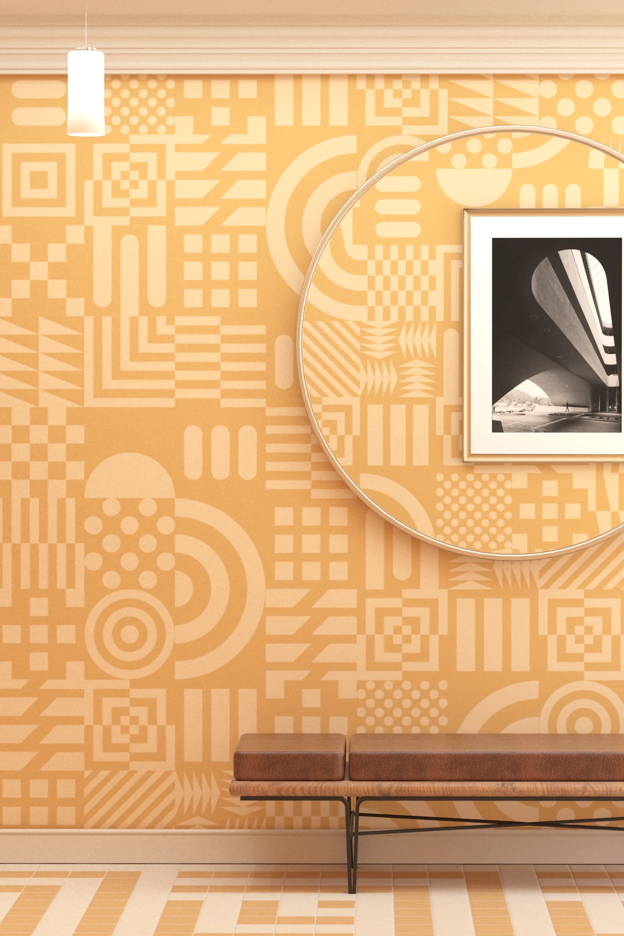
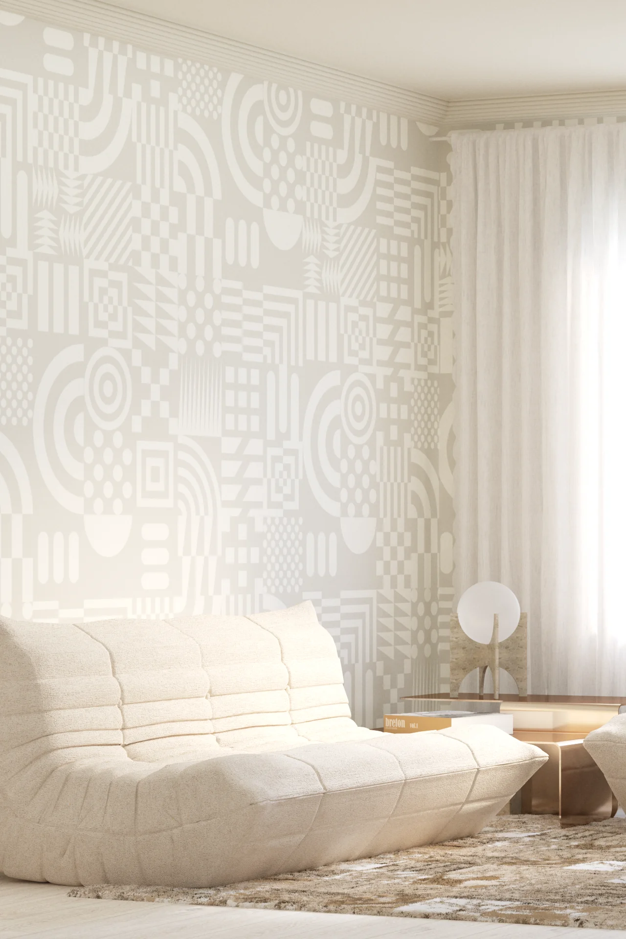
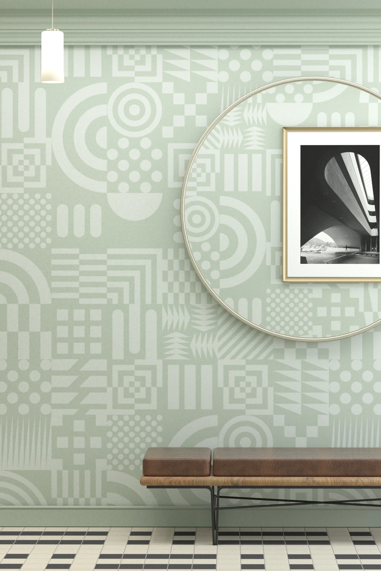
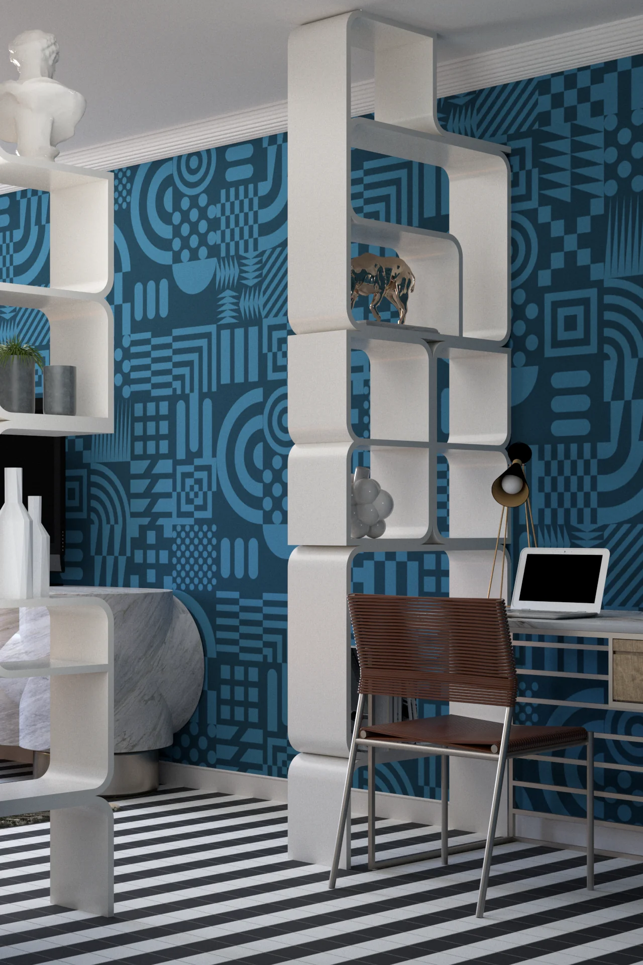
The individual symbols aren’t there to be deciphered. Some look vaguely familiar, others completely invented, but none carries enough importance to dominate the pattern. They behave more like graphic material, accumulating until the wall becomes a dense field of signs, shapes and interruptions.
I like the democracy of that. There is no obvious hero motif and very little hierarchy. A tiny mark can have as much presence as something considerably larger, while repetition occasionally produces coincidences and clusters that seem important for no particular reason.
Seen from further away, much of this detail collapses into texture. Move closer and the individual graphics start asserting themselves again. That change in reading gives Glyph its restless quality. It never quite settles into either pattern or image.
For all its apparent chaos, there is a curious confidence to it. Glyph comes from a graphic culture that wasn’t afraid of visual noise, when more really could be more and a crowded page could possess an energy that careful composition might have tidied away. Sometimes the interesting bit is the mess.
The Colours