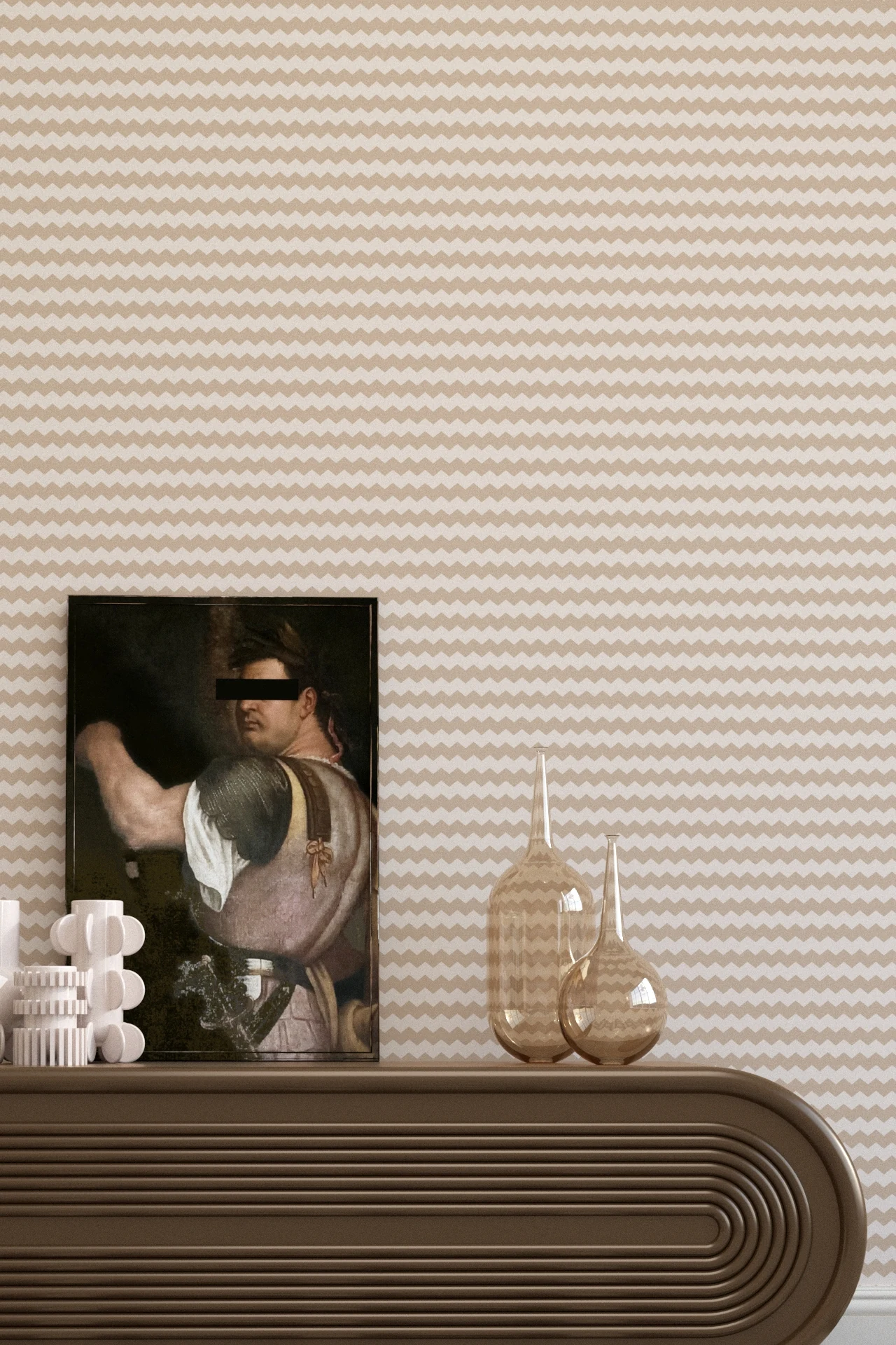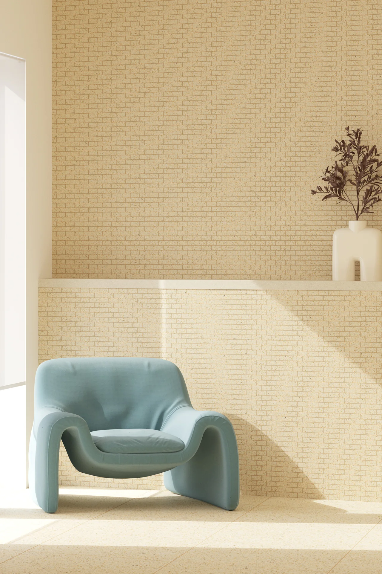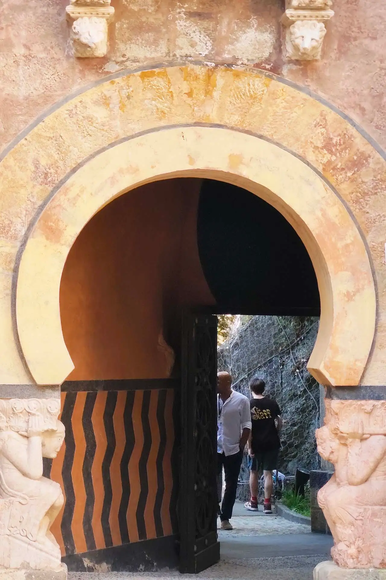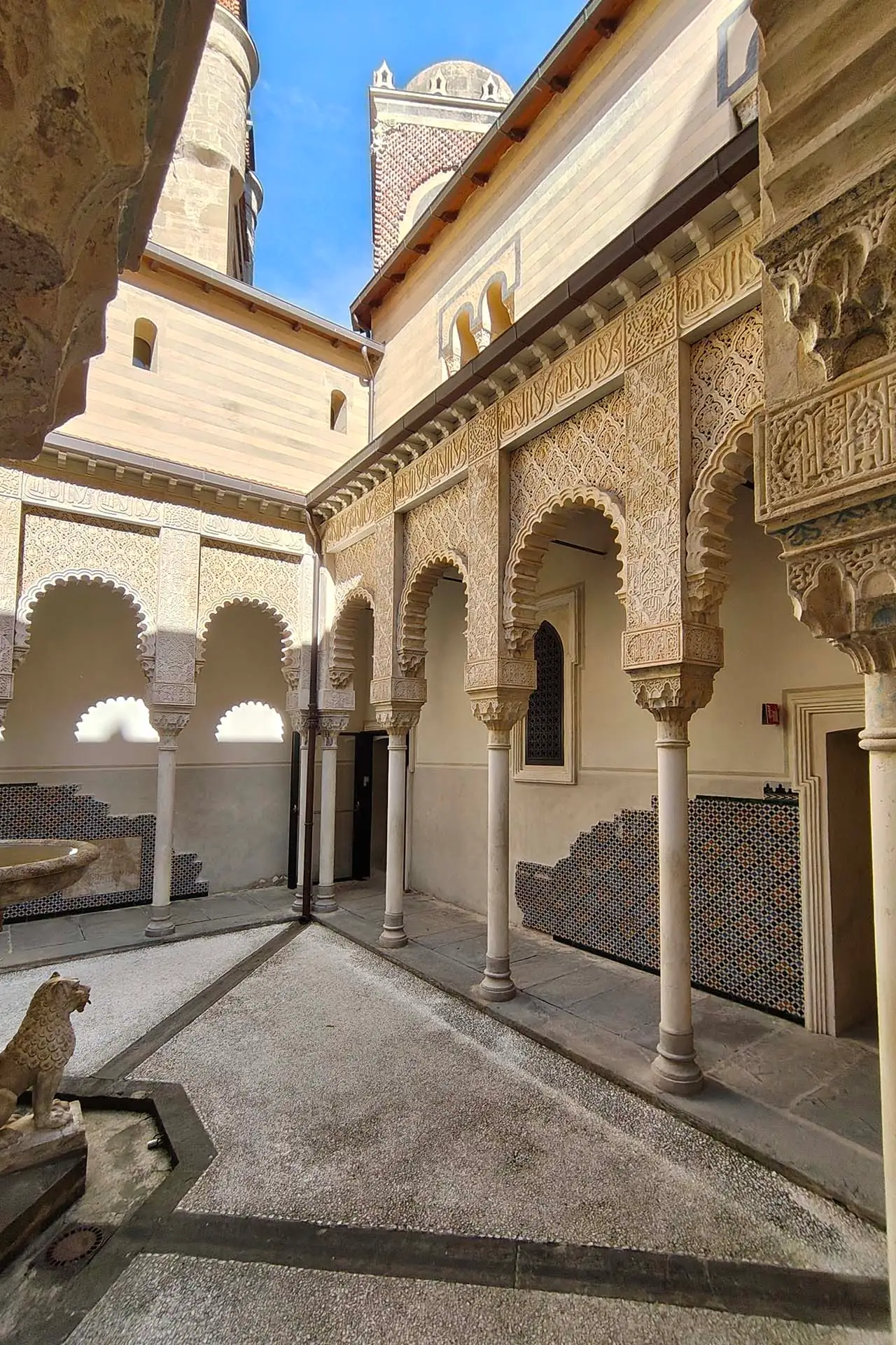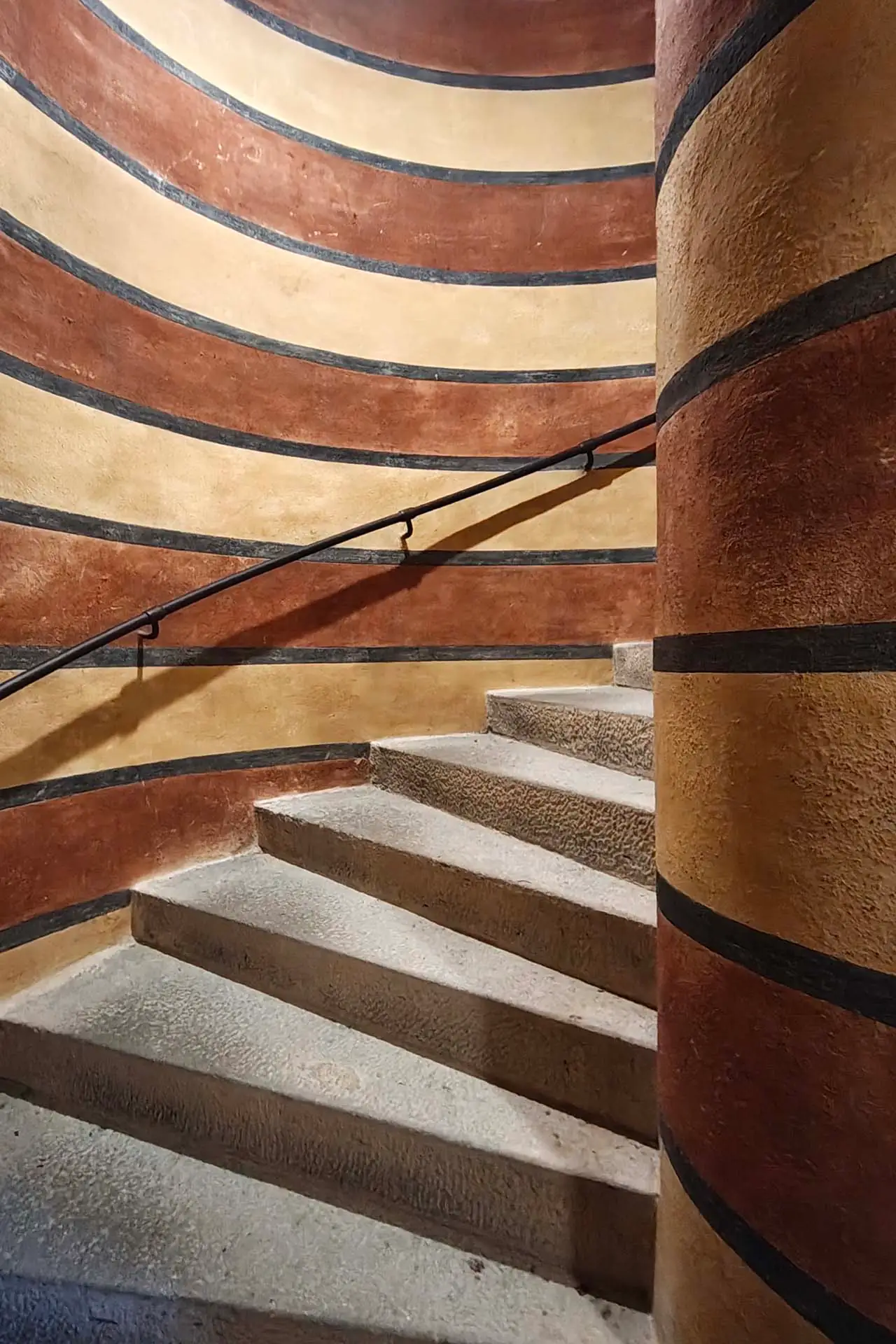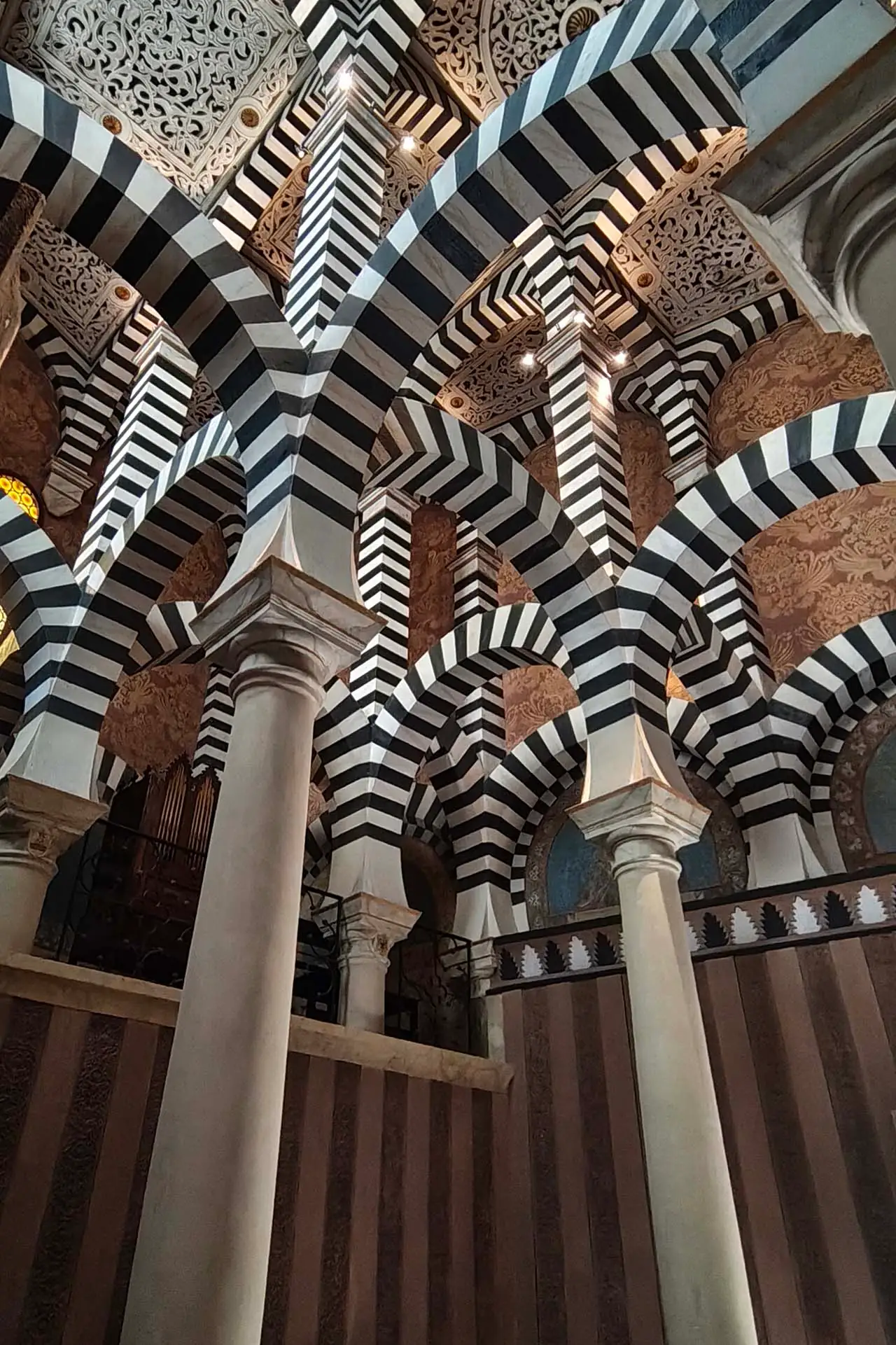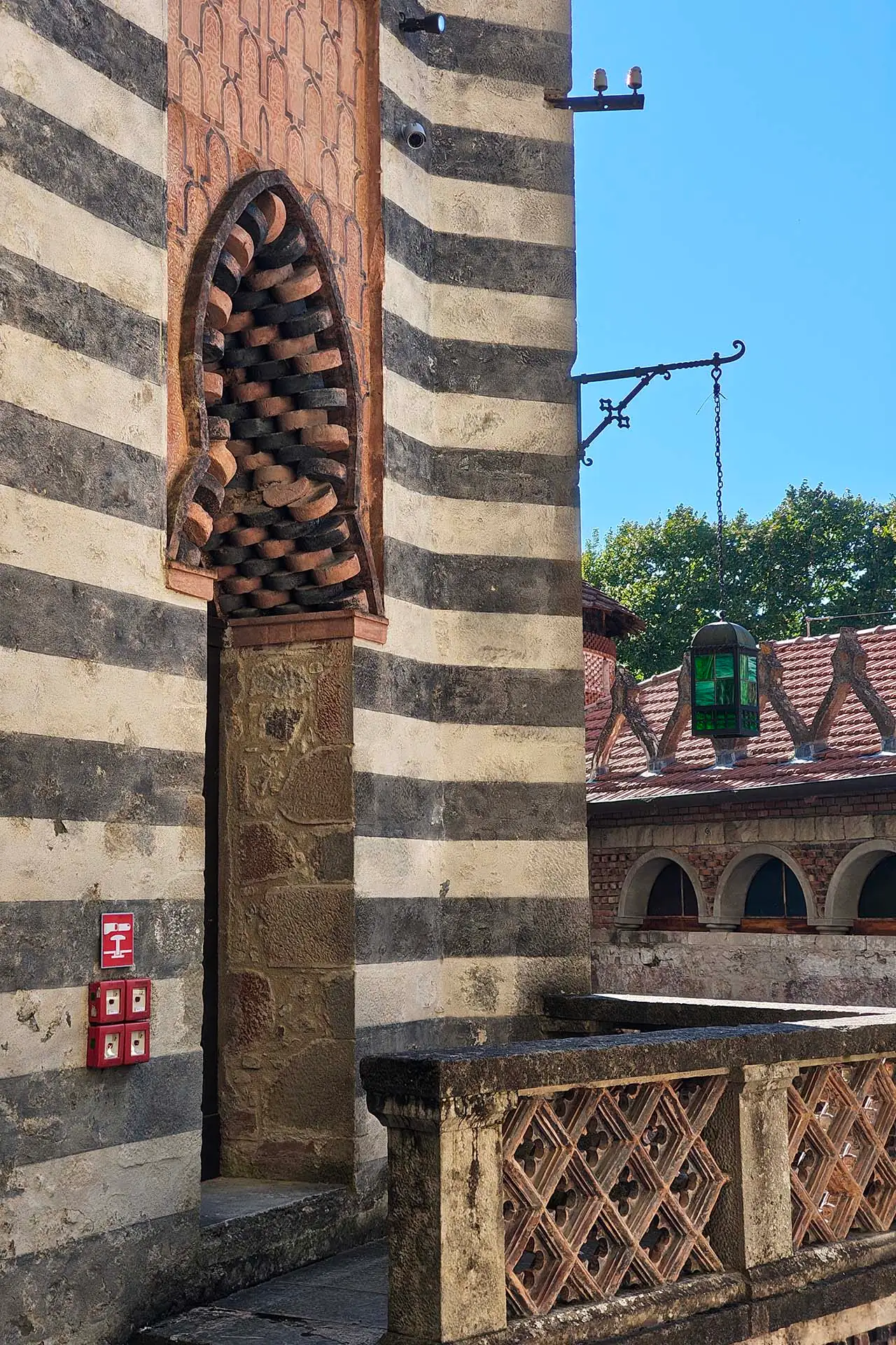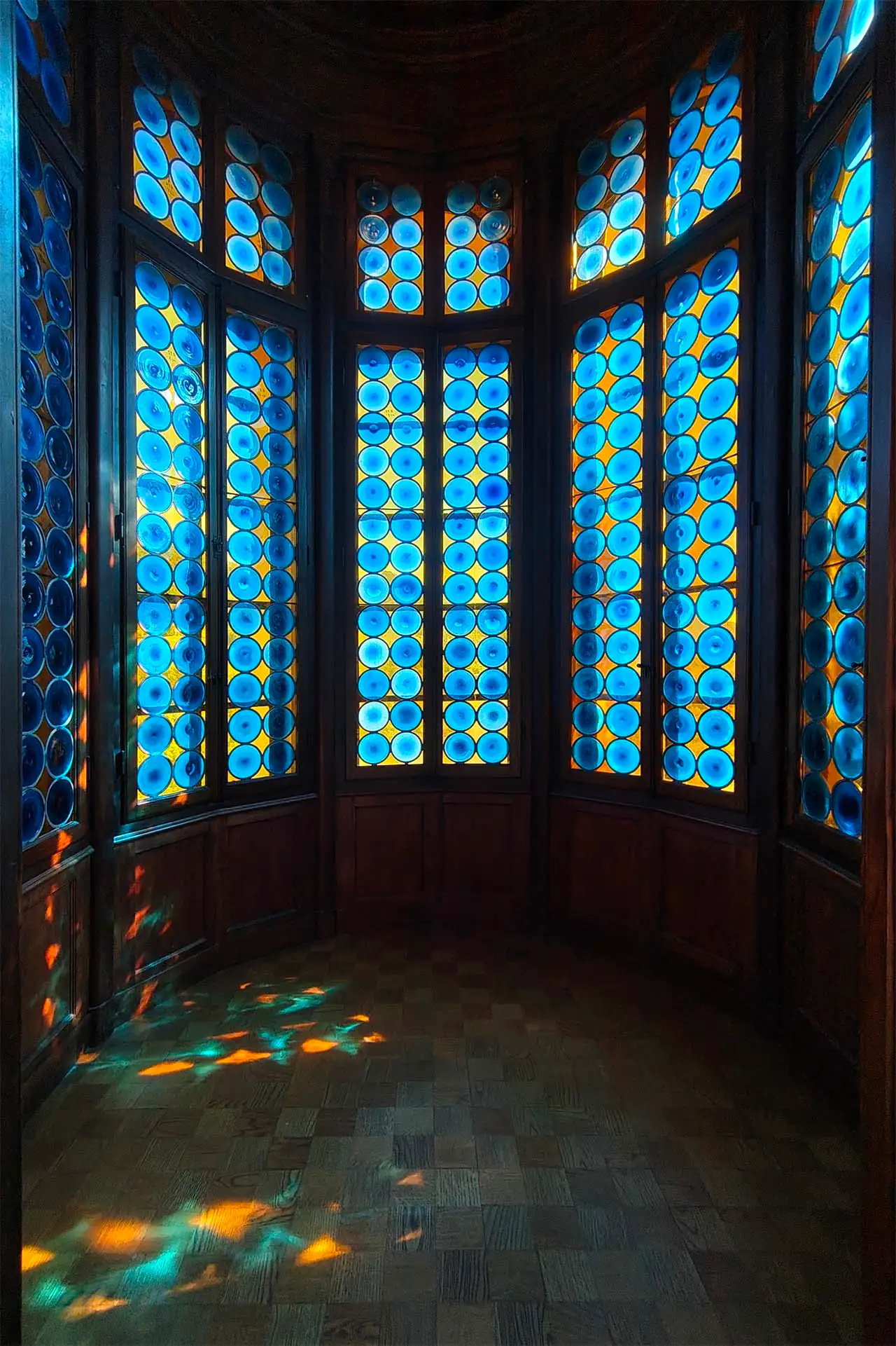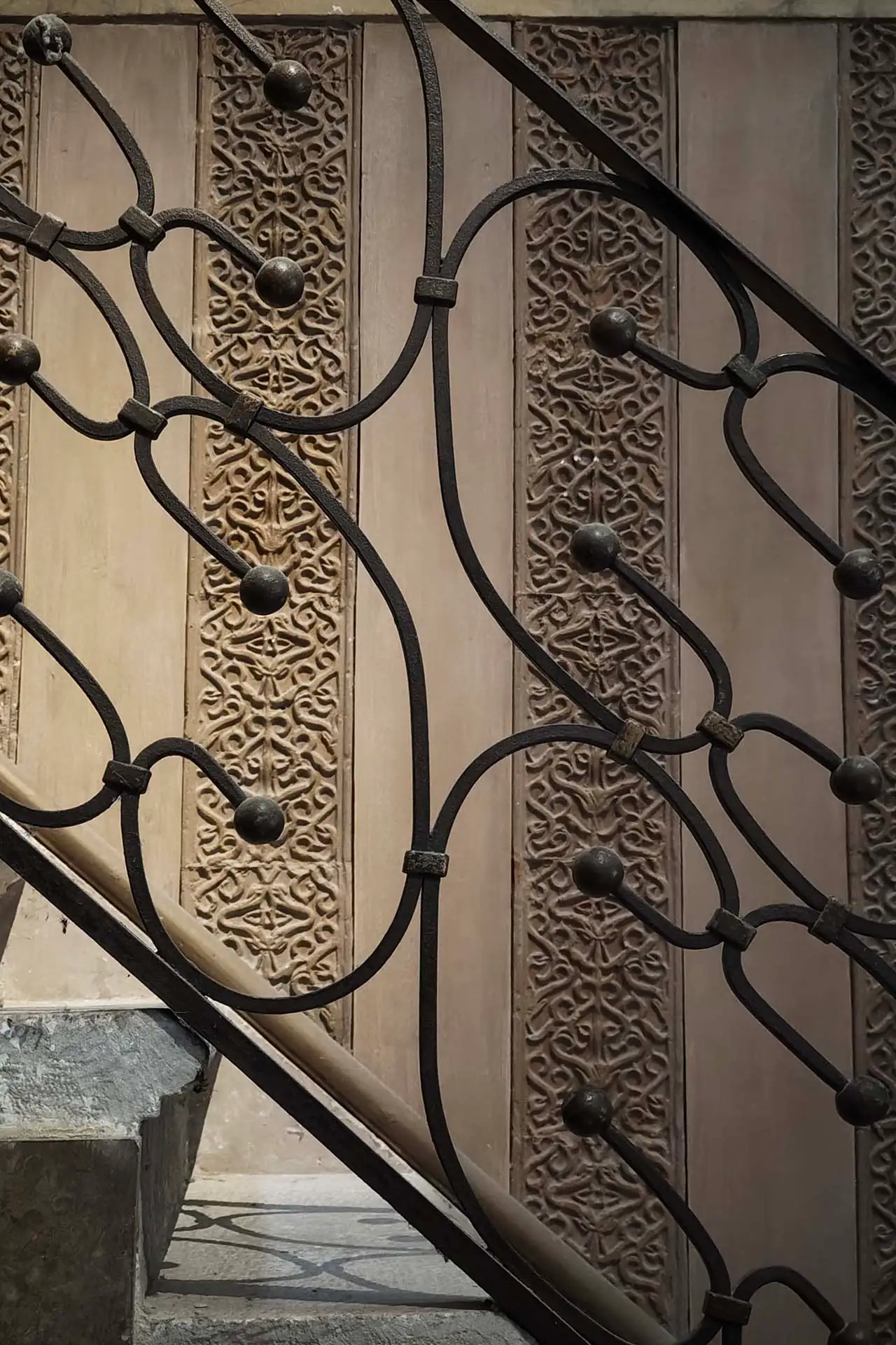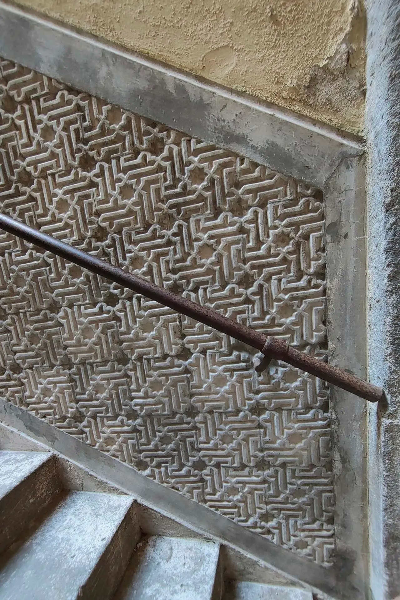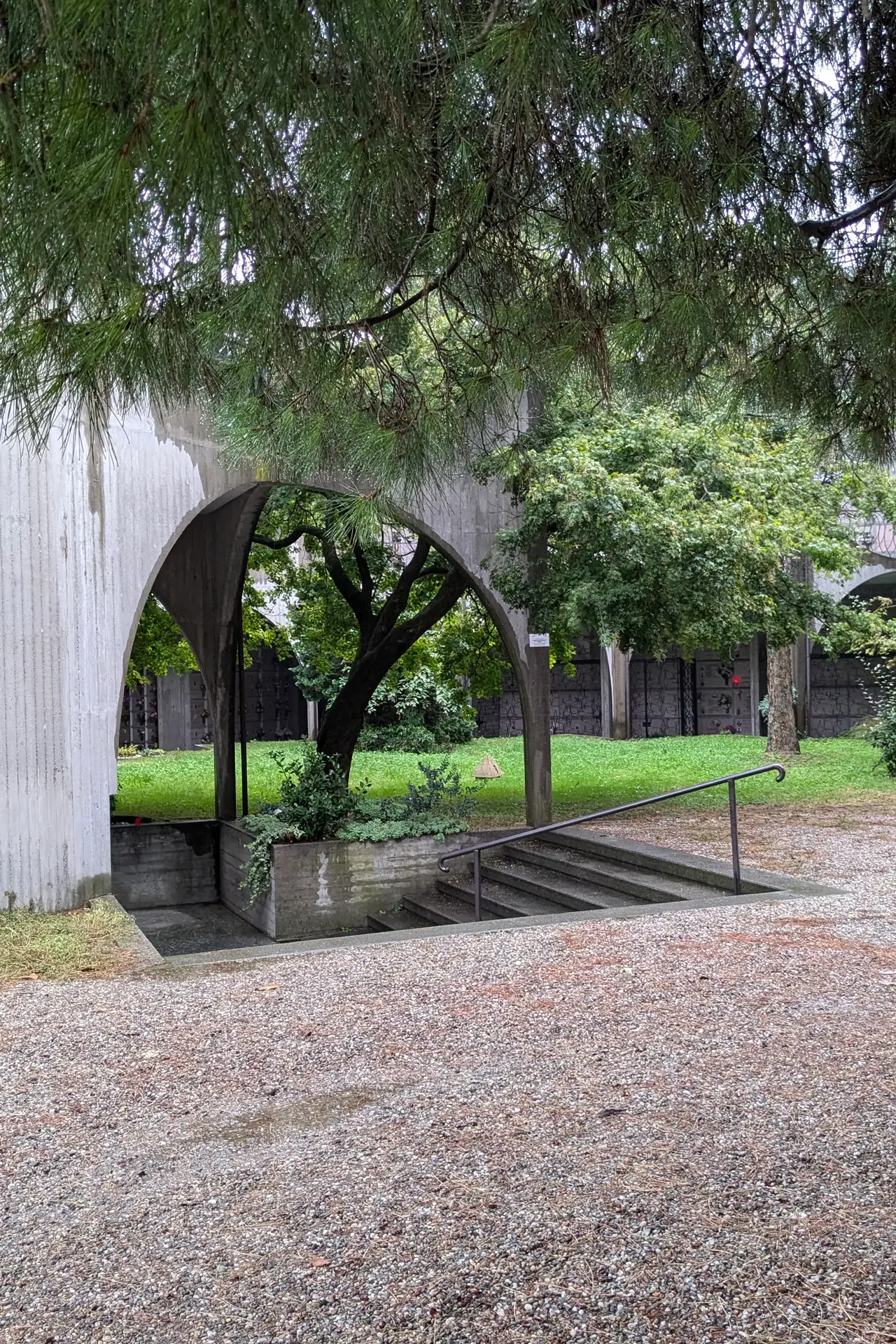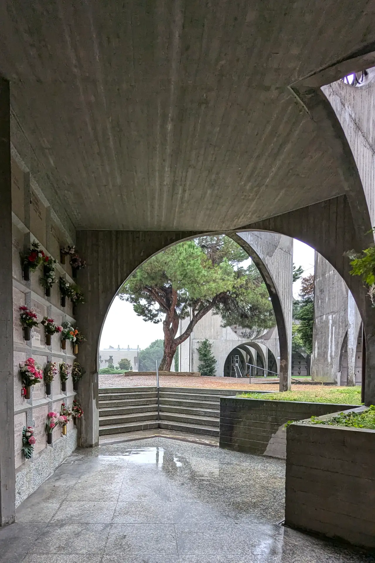
Some colours seem to carry their own temperature. This palette sits somewhere between late afternoon sunlight and the softened tones that appear just before evening.
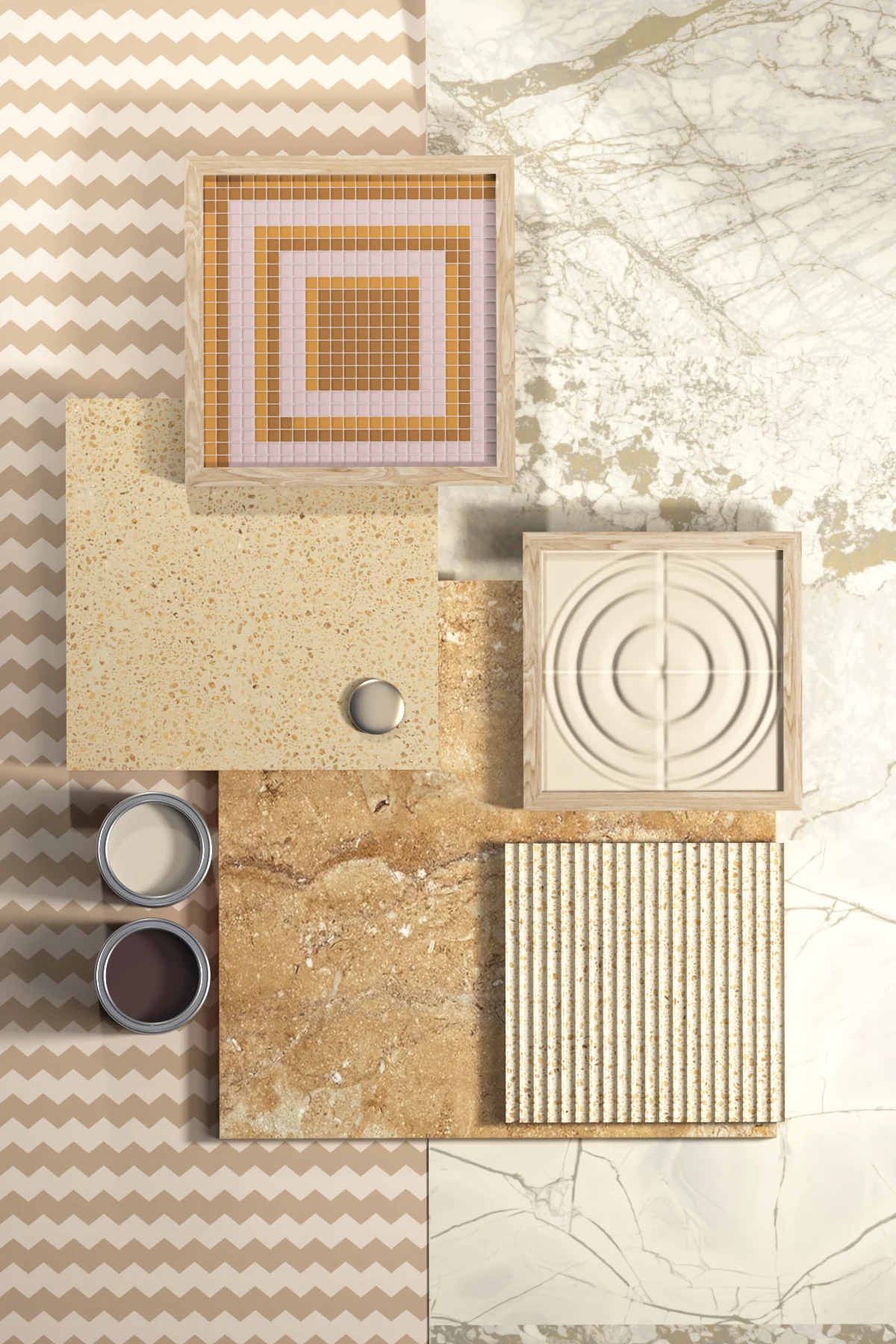
Warm stone, chalky cream and faded caramel create the foundation. However, nothing feels particularly definite. Pink drifts towards plaster, beige becomes almost honeyed, while brown brings a deeper, earthier note.
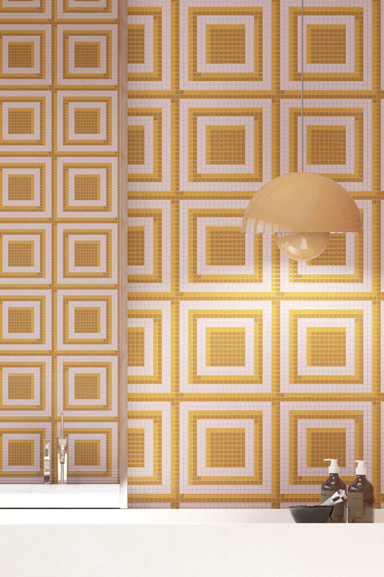
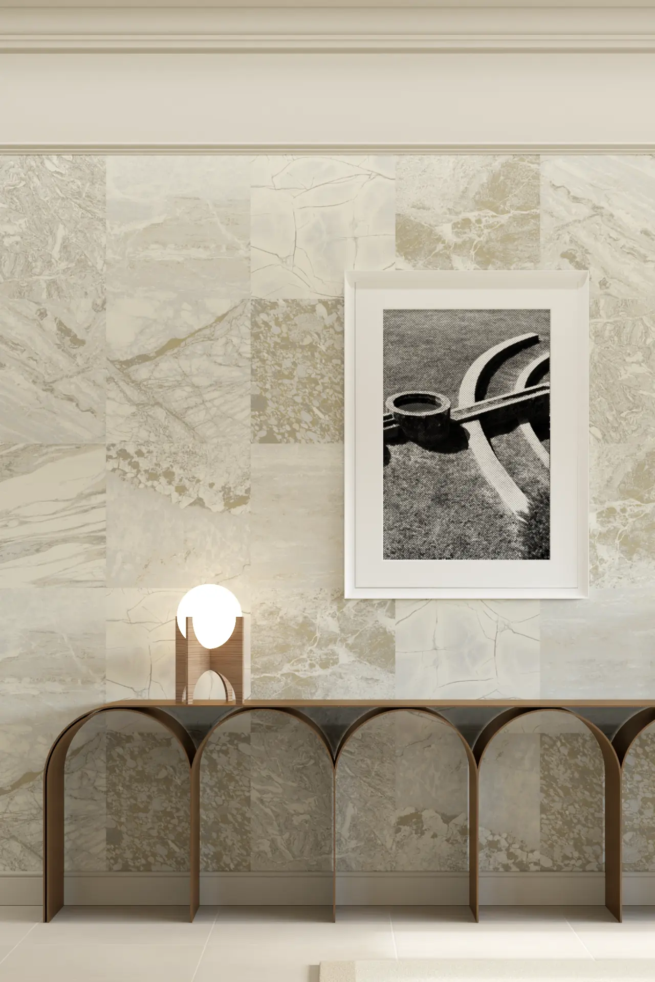

That slight uncertainty makes the colours more interesting. They belong together without looking carefully coordinated.
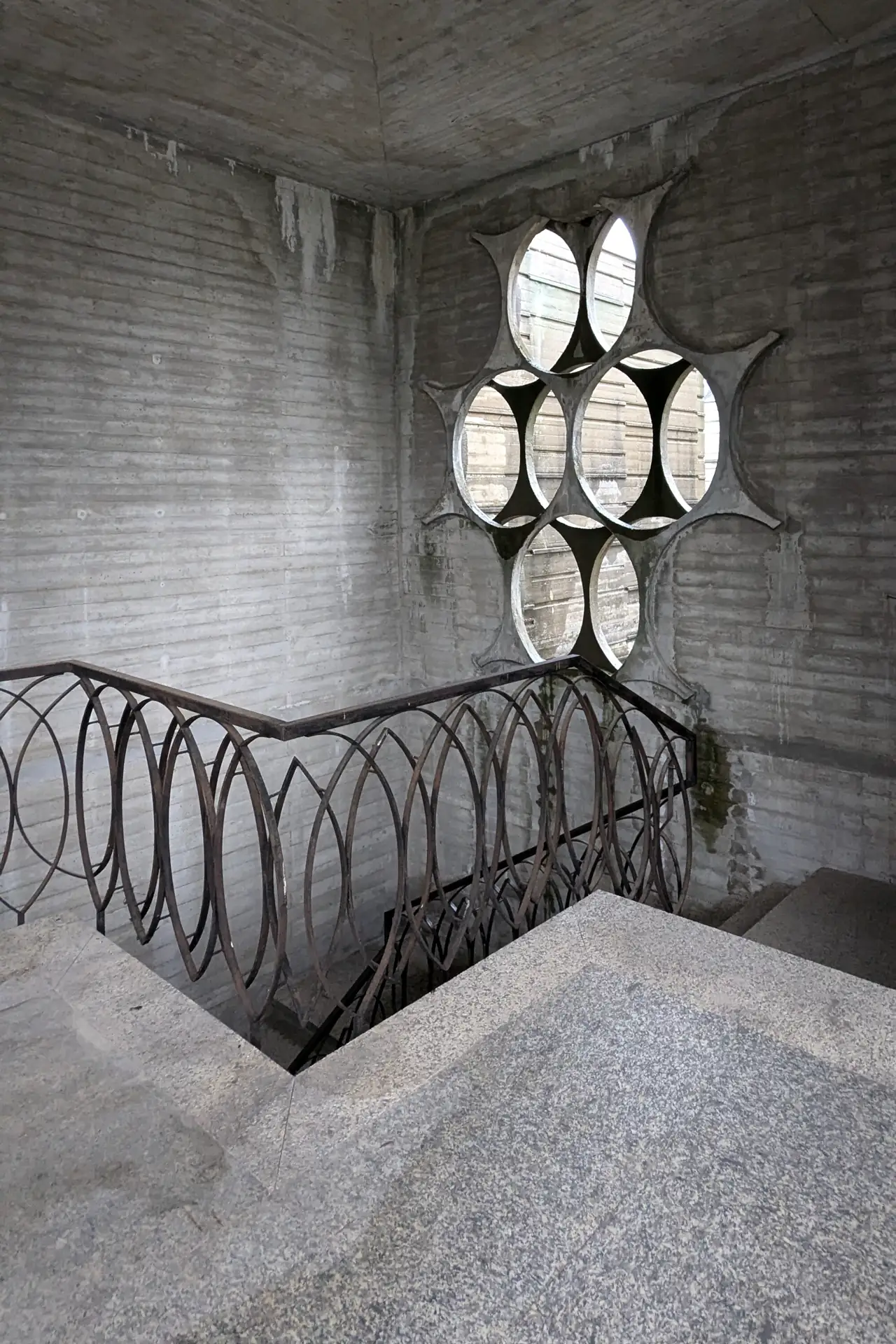
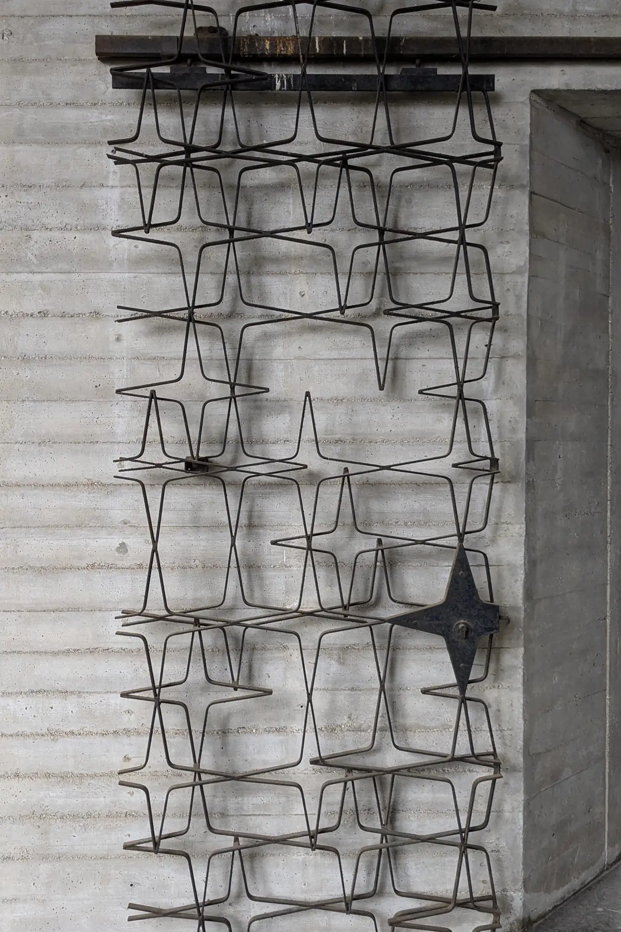
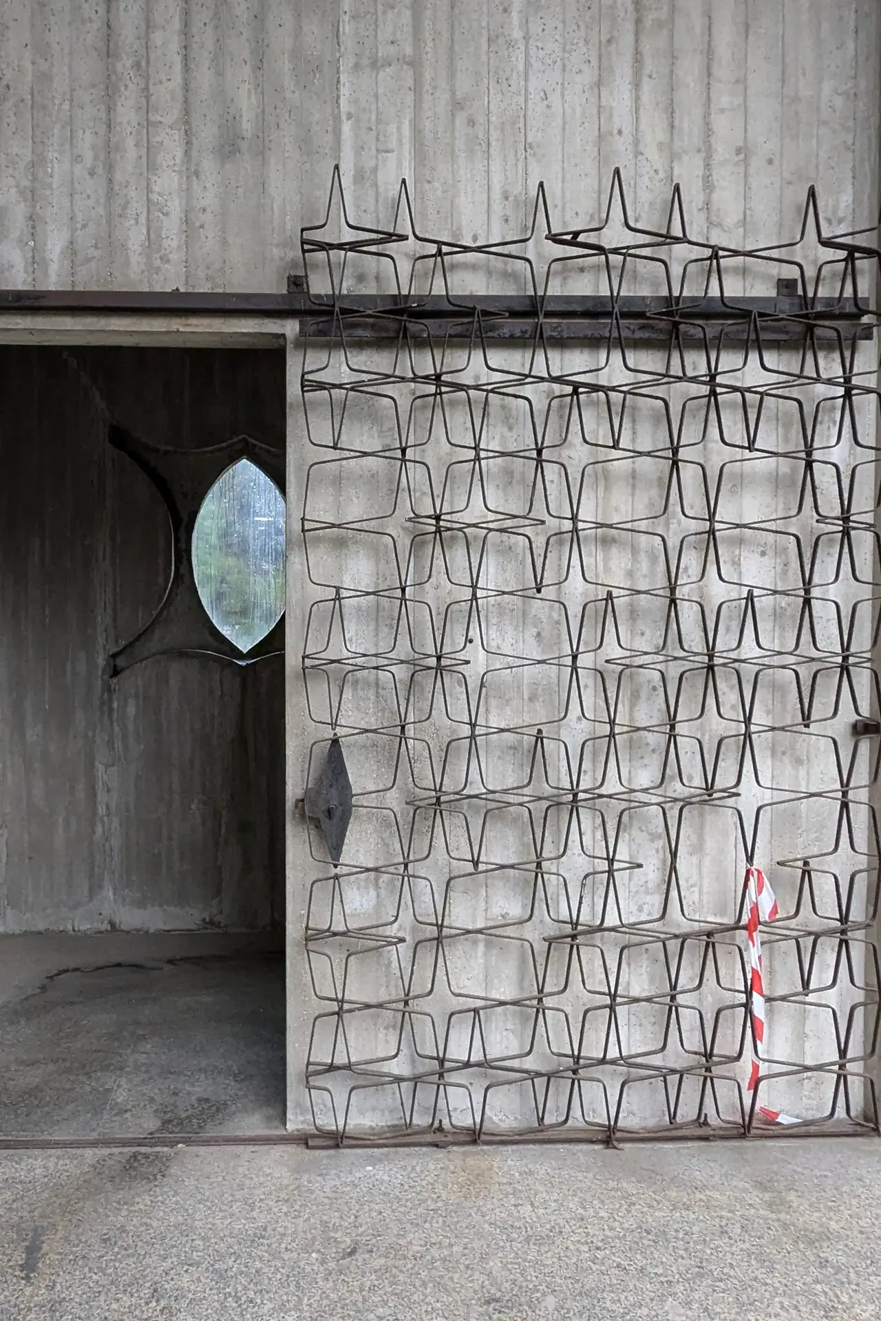
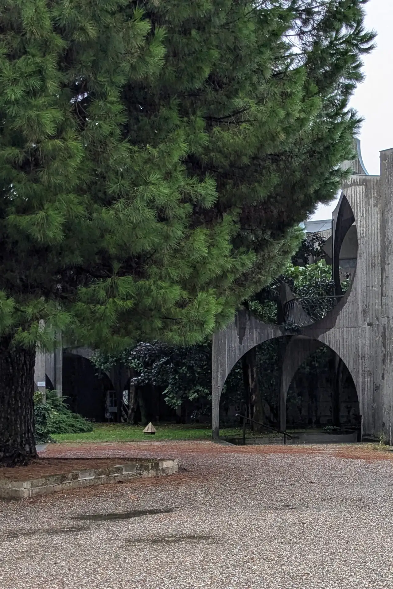
Texture matters just as much. Terrazzo, marble, glass and relief surfaces catch light differently. Some absorb it, while others return a little glow. Together, they give a restrained palette far more depth than colour alone could achieve.
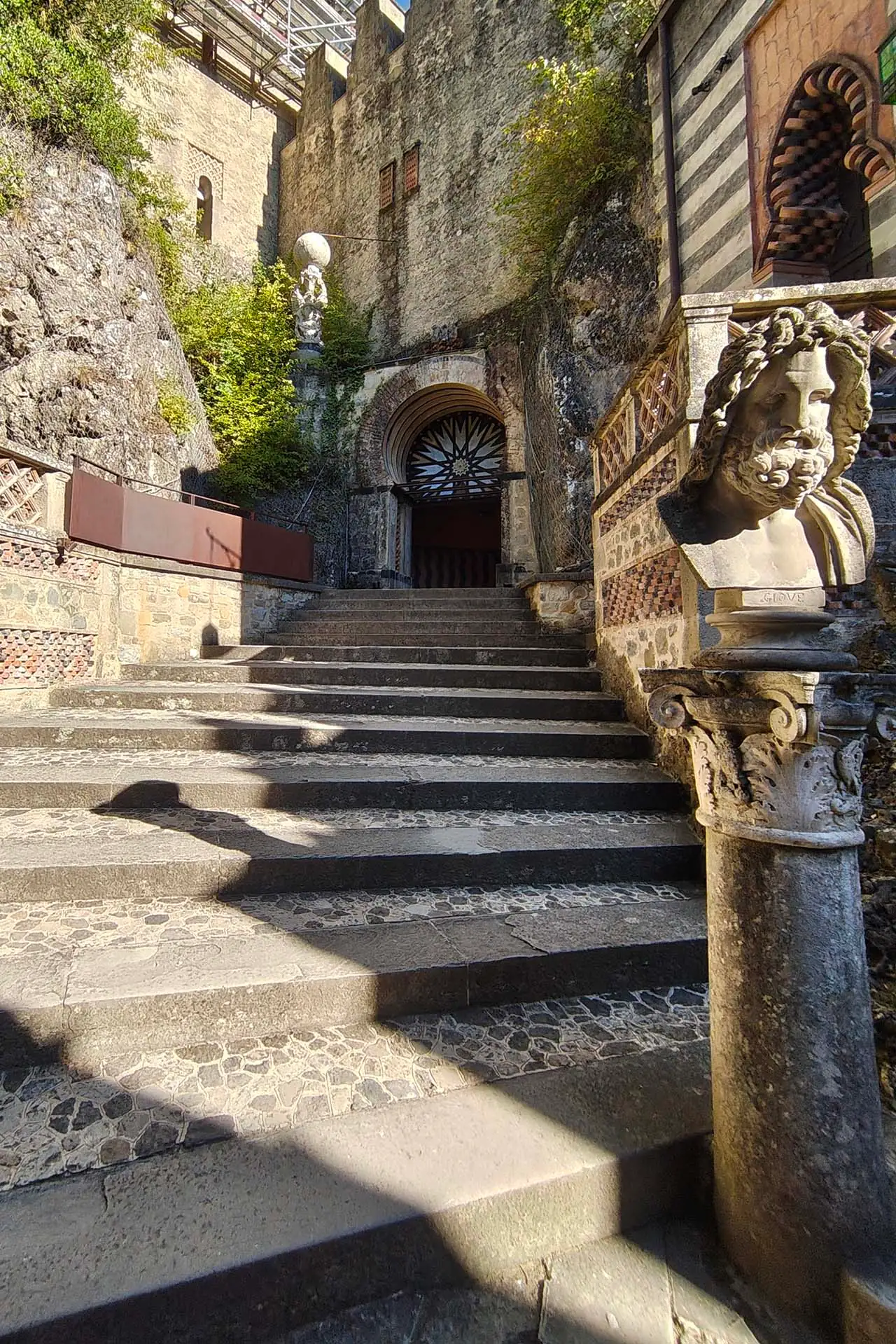
There is also a tactile quality running through the scheme. Grooves, aggregate, veining and small mosaic pieces invite closer inspection. These are surfaces that make you want to reach out and touch them.
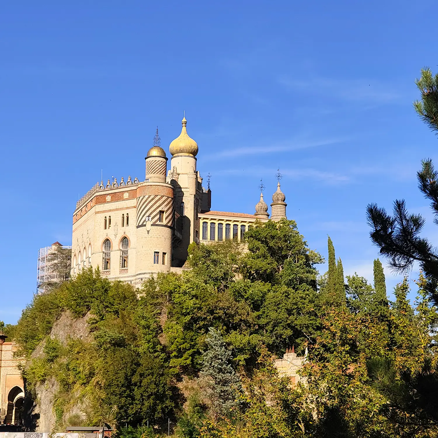
Golden hour feels like an appropriate reference because it changes familiar things without completely transforming them. Hard surfaces appear softer and pale colours become warmer. Even neutral materials briefly gain an unexpected richness.
This colour story tries to hold onto a little of that moment. Not the obvious gold of sunlight, but its hazier after-effect. Warm, slightly dusty and quietly luminous.