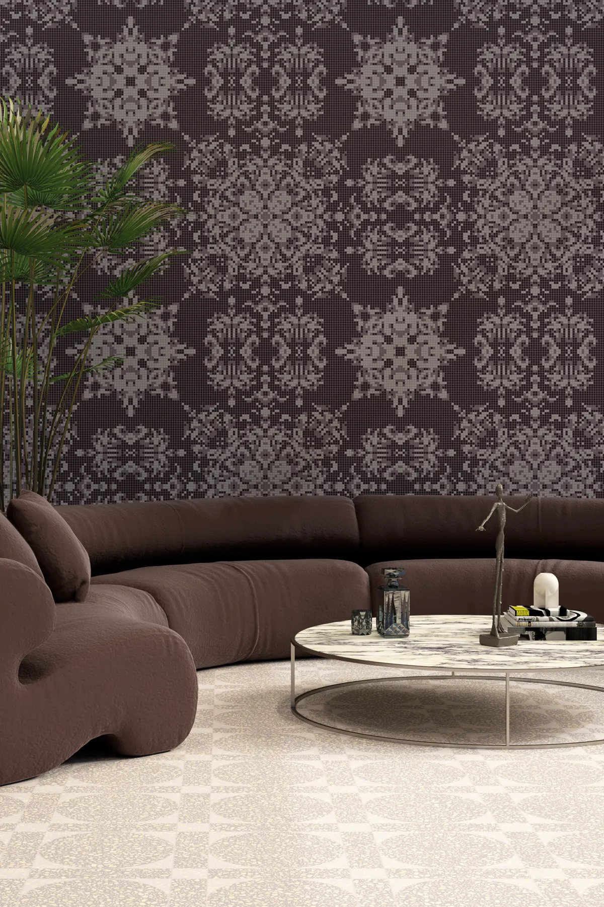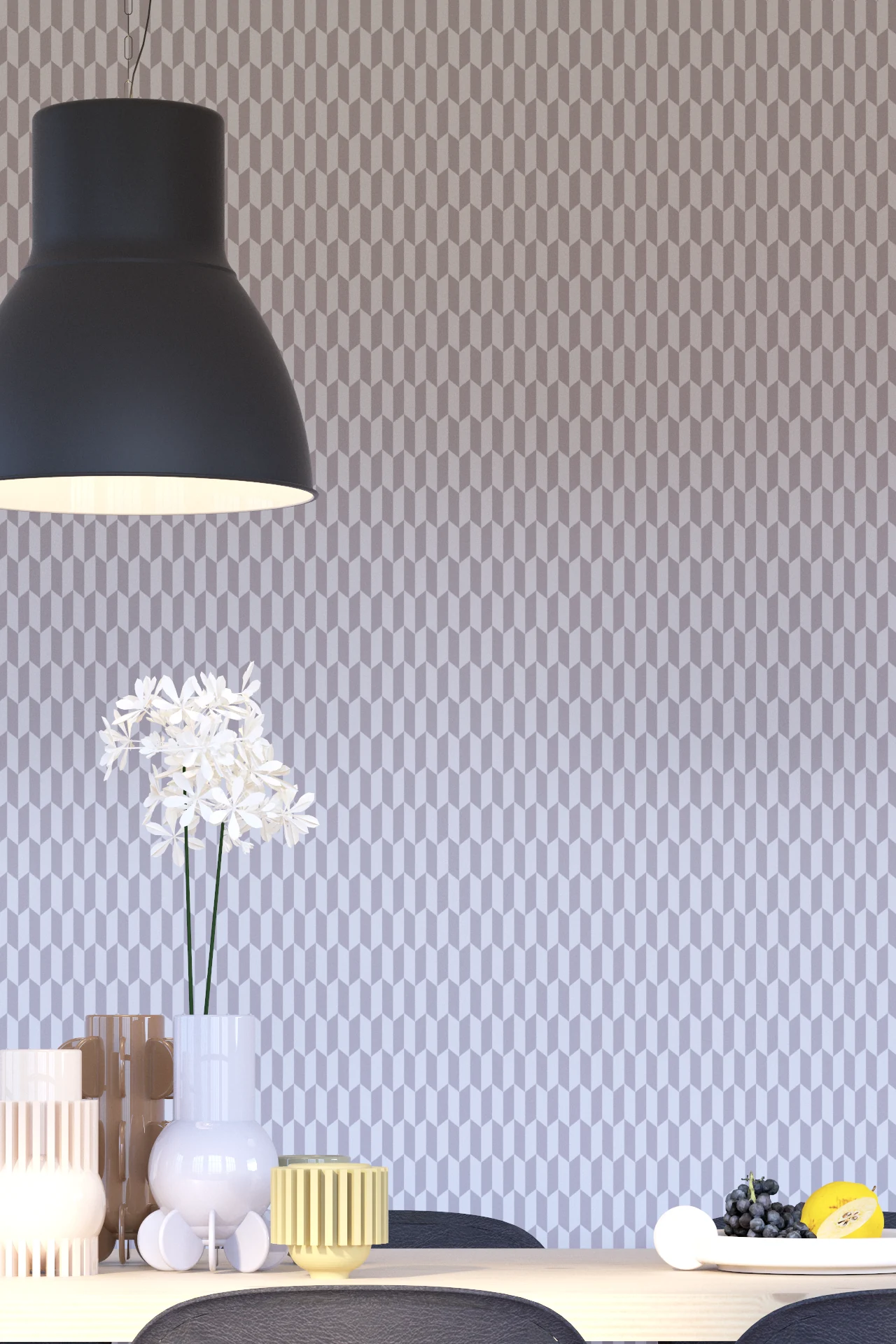
Some colours announce themselves. Plum has enough confidence not to bother. Its richness comes from an unusual place. Purple, red and brown settle into one another, creating something deep but surprisingly quiet. In certain light, it almost behaves like a neutral.
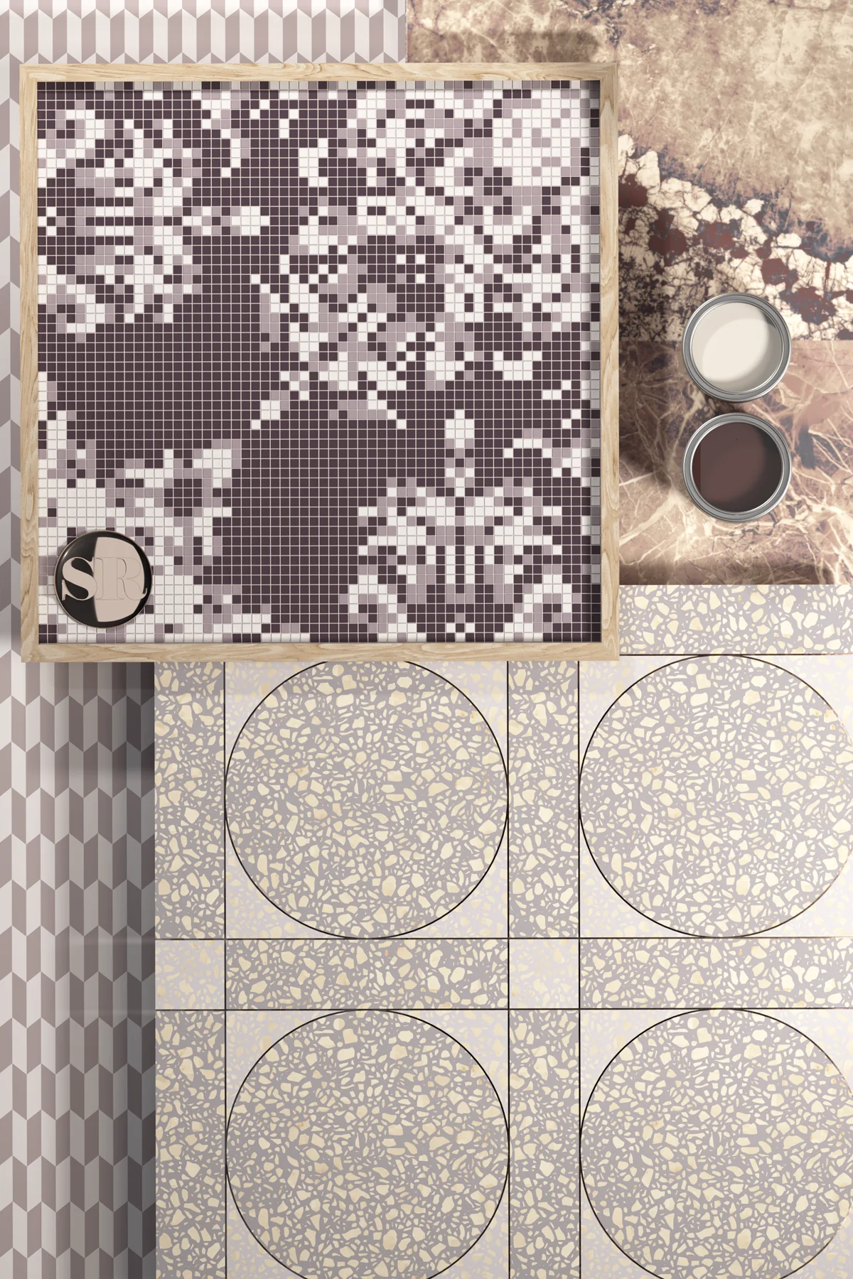
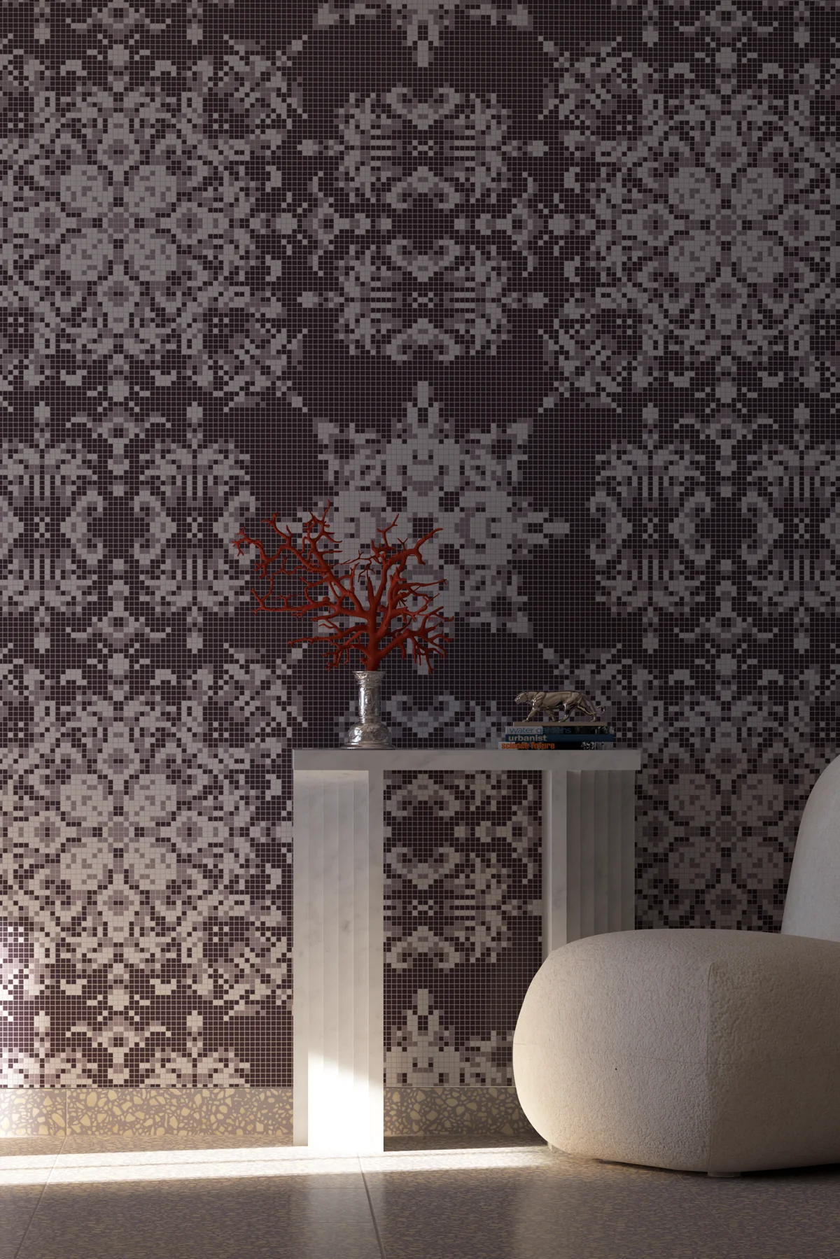
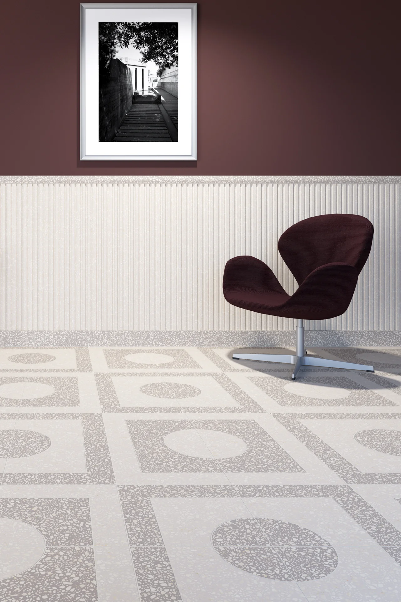
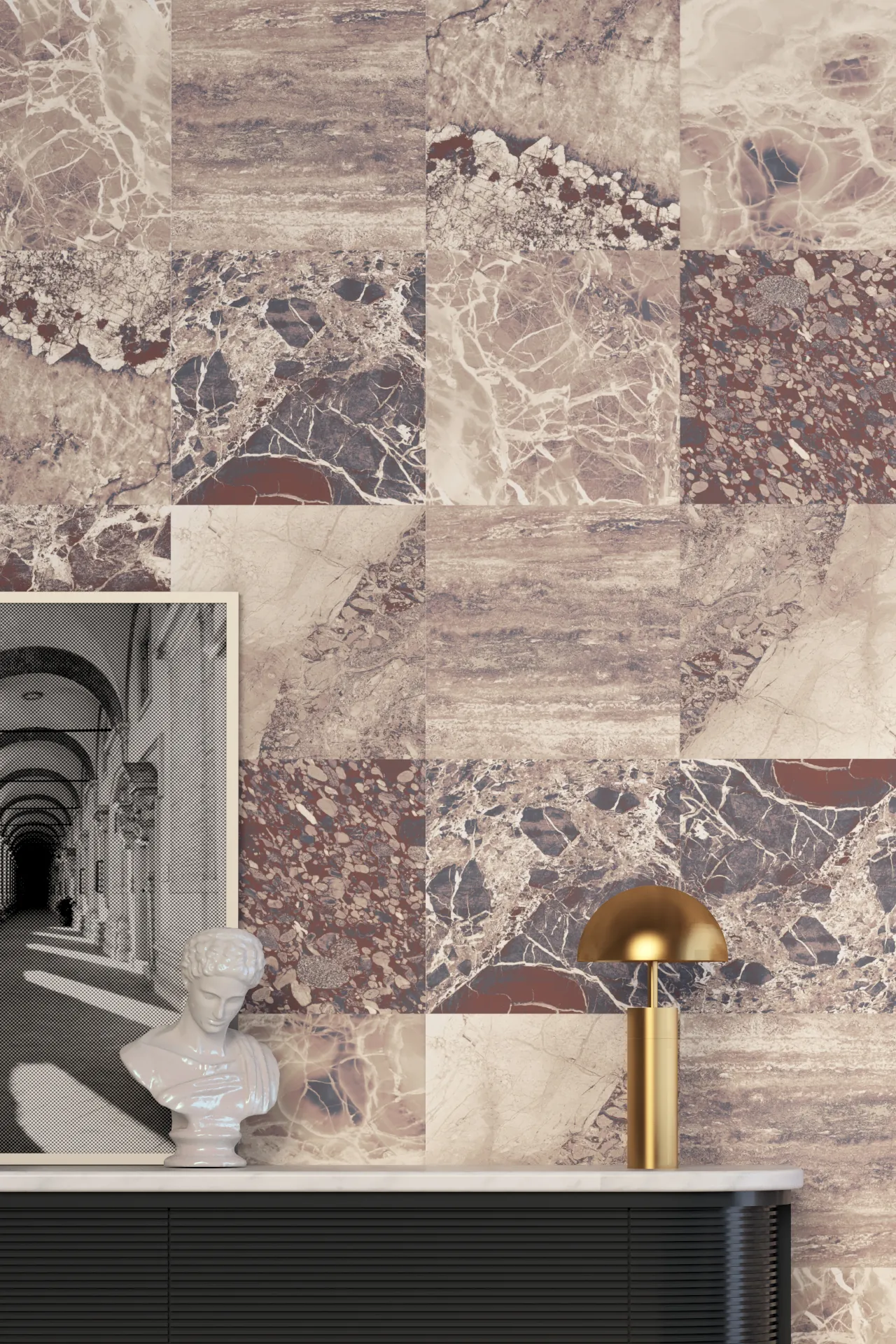
For years, darker interiors relied heavily on black, charcoal and navy. Plum offers the same visual weight, but with considerably more warmth.
It also carries an old association with luxury, although the mood has changed. Gone are the velvet curtains and theatrical grandeur. Today, plum feels cleaner, calmer and rather more architectural. There is something wonderfully grown up about that transition.
The colour retains its depth, but loses the formality once attached to it. Against cream, stone and softened grey, it can feel almost understated.
That makes Quiet Luxury less about expense and more about confidence. Nothing needs excessive polish or obvious grandeur. Richness comes from colours that reveal themselves gradually and materials that reward closer attention.
Plum fits naturally into that world. It can hold darkness without becoming sombre, while its warmth prevents pale neutrals feeling too pristine.
The result feels assured rather than ostentatious. Luxury, in this instance, comes from knowing when enough really is enough.