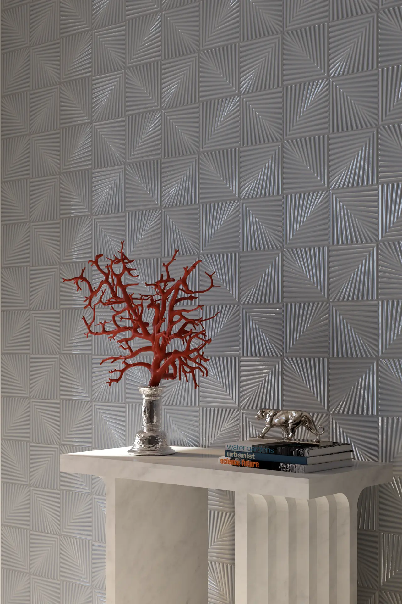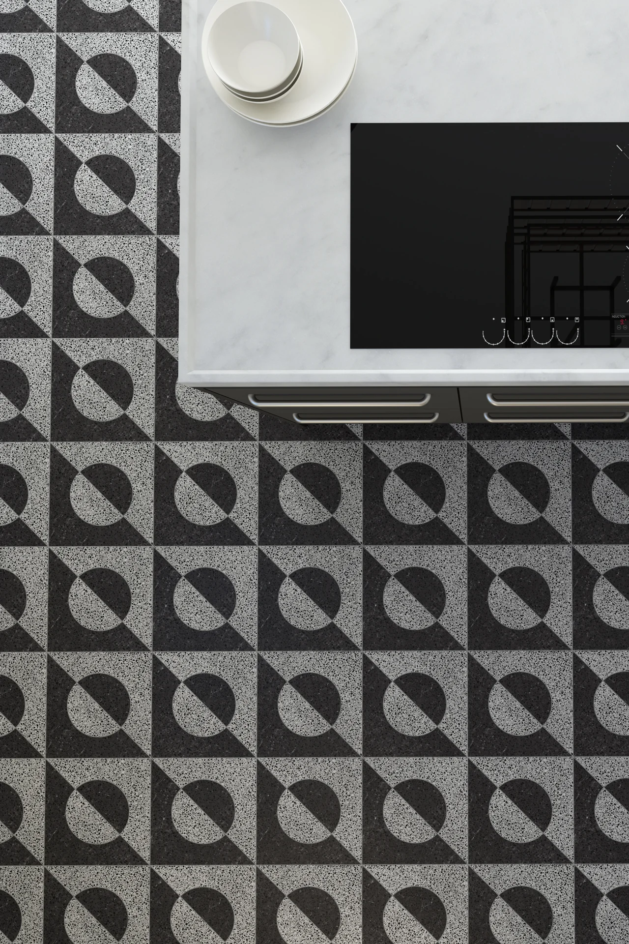
Blush becomes far more interesting when it loses its sweetness. Here, peach appears almost as a flash of warmth against silver, stone and smoky grey. It feels less romantic and more urbane. There is still softness, but it comes with a little polish and confidence.
The palette has the atmosphere of an elegant city interior after dark. Metallic surfaces catch fragments of light. Pale stone provides a quieter counterpoint. Meanwhile, darker botanical tones introduce something richer and less predictable.
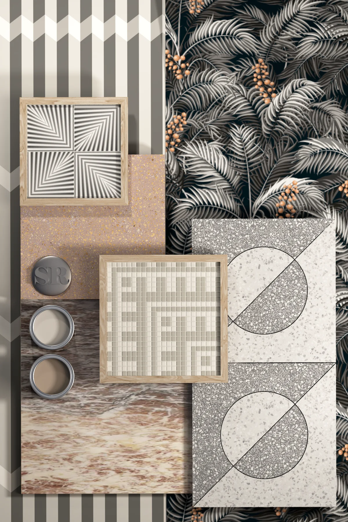
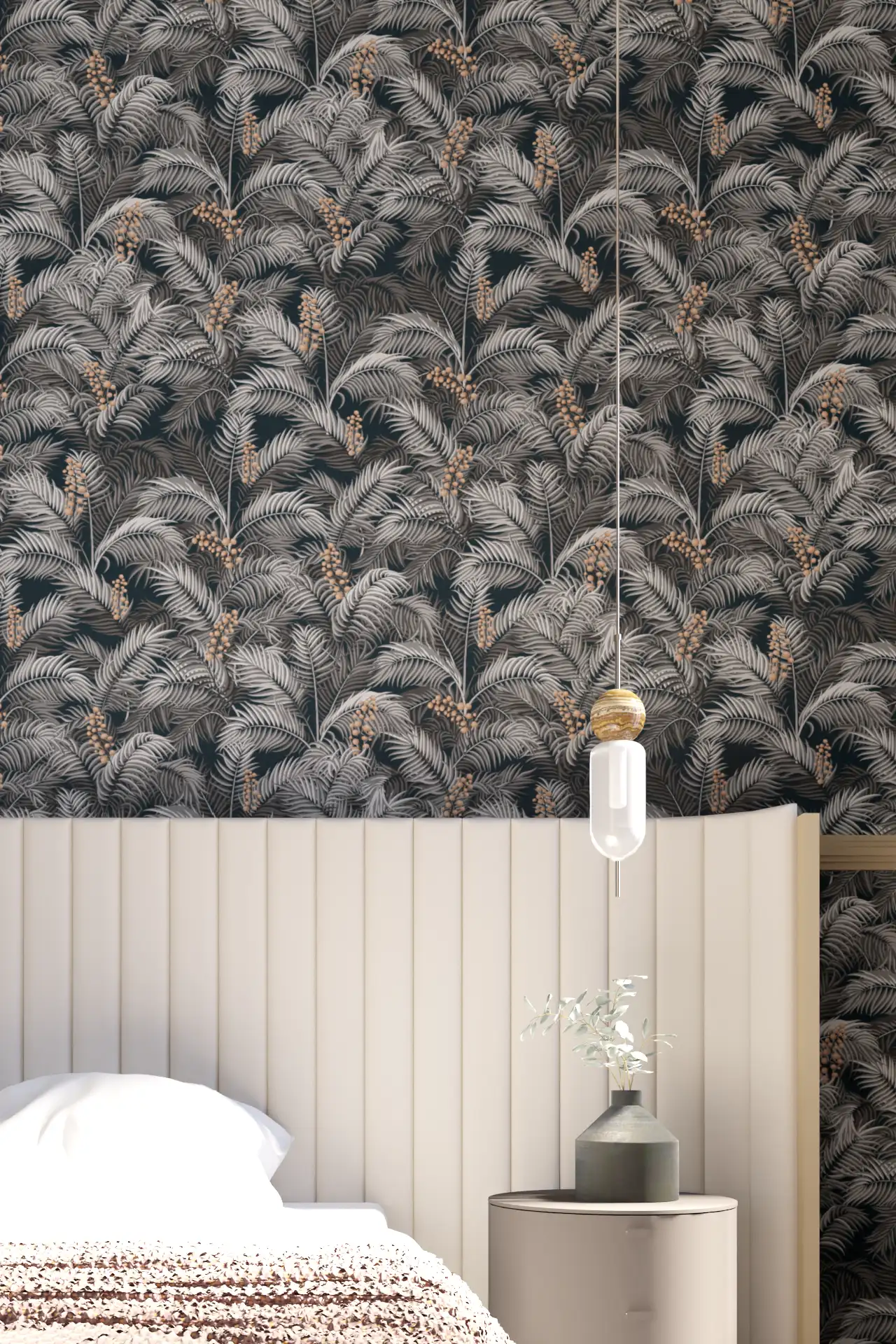

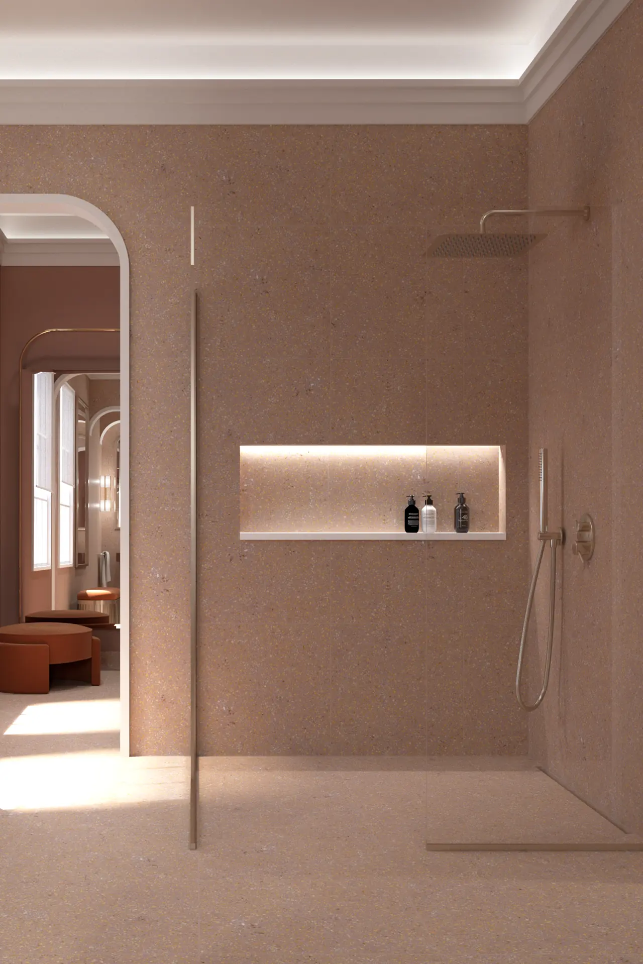
Texture keeps everything from becoming too immaculate. Fine mosaic, terrazzo, veined stone and deep relief each respond differently to light. Smoothness sits beside grain, while precise geometry meets the looseness of foliage.
Peach changes the mood completely. Used sparingly, it has an unexpected liveliness among the greys. It warms rather than decorates, appearing almost like colour reflected from somewhere beyond the room.
There is a touch of glamour here, although it never becomes showy. Silver replaces gold, grey replaces black, and blush provides warmth without turning pretty.
Modern Blush belongs somewhere between restraint and indulgence. It feels composed but never severe, decorative without becoming nostalgic.
Most importantly, it suggests that contemporary design need not feel hard edged. A little warmth can make precision feel considerably more inviting.